2025
Redesigning a banking app to boost monthly engagement with credit card features by 60%
José Manuel Zevallos, Stanford University
Rol
Product Design
UI Design
Category
App mobile
iOS / Android
Project Type
Banking app
Redesign interface
Professional website of José Manuel Zevallos
Digital Media Designer © 2025. All rights reserved.
zevallosj147@gmail.com
LinkedIn: in/jmanuelzevallos
Challenge
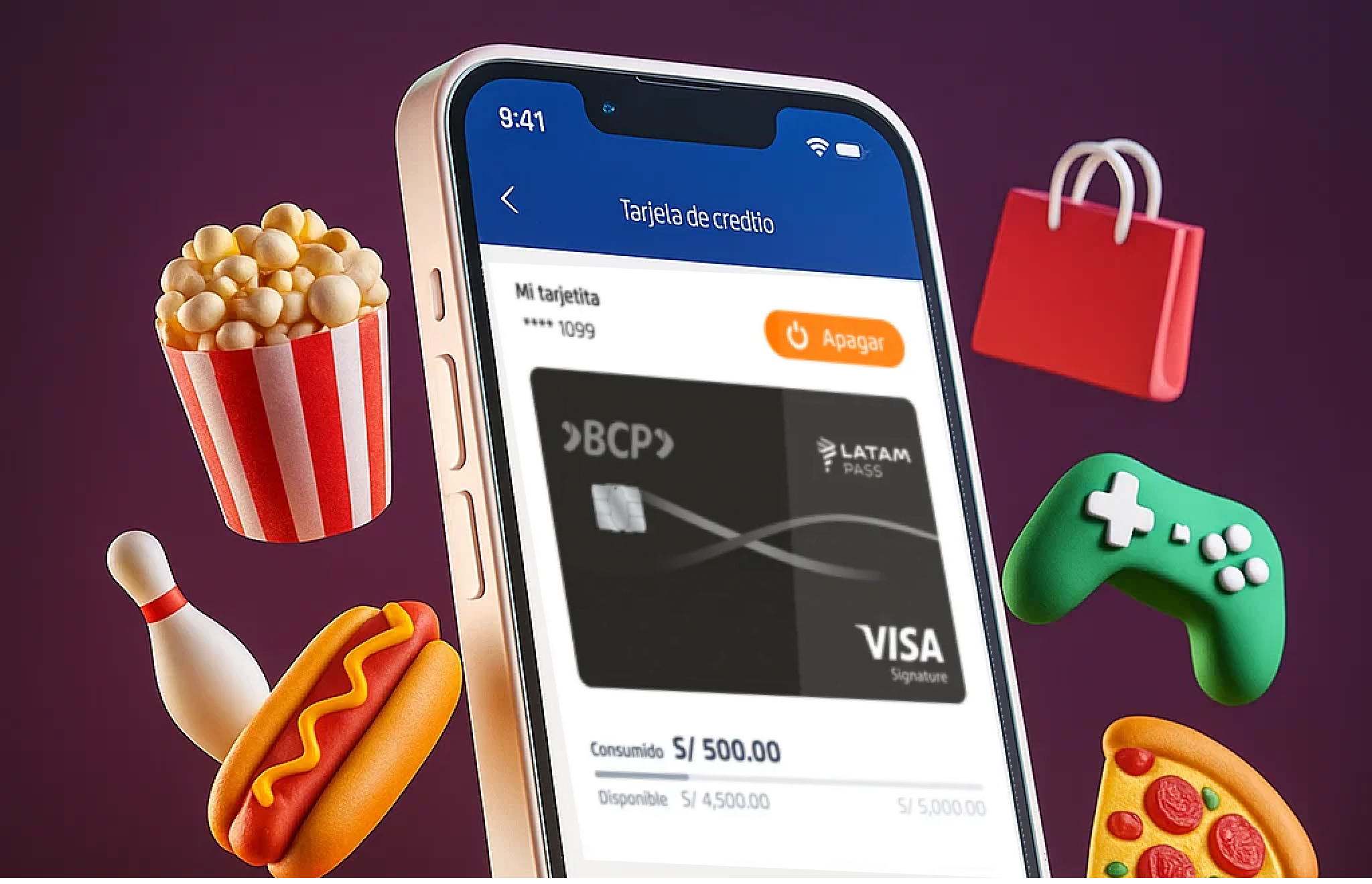
The current process for requesting, activating, managing, and using cards within the banking app creates friction for users and leads to a high dependency on customer support channels. Functionality is scattered and poorly structured, negatively impacting adoption, early usage, and perceived product value. This affects both the customer experience and core business objectives.
Hypothesis
If the card experience were redesigned as a connected, guided, and scalable flow integrating acquisition, activation, and initial usage friction would be reduced, digital conversion would increase, customer satisfaction would improve, and operational load on the call center would decrease.
Summary
The project focused on redesigning the credit card experience within the banking app to improve visibility, structure, and usability. The goal was to create a cohesive and intuitive flow that connects acquisition, activation, and usage stages, enabling customers to better understand and manage their cards. This initiative sought to enhance user engagement, reduce friction, and drive a measurable impact on digital adoption and operational efficiency.
Problem Users Faced
Users found it difficult to locate and understand card-related functionalities, such as activation, limit management, or payment options. The experience felt fragmented and inconsistent, leading to confusion, distrust, and frequent reliance on customer service for basic operations. This lack of clarity directly affected product perception and overall satisfaction.
Business Objective
Increase digital adoption and card feature usage by 60% through a unified, user-centered experience that reduces support dependency and boosts self-service capabilities. The redesign aimed to align customer needs with business goals, improving retention, satisfaction (CES/NPS), and revenue from card operations.
Product Owner & Business Request
The Product Owner requested a strategic redesign to consolidate all card-related features into a single, seamless interface. The business expected the new experience to reduce call center volume, strengthen engagement with digital channels, and position the credit card as a key value driver within the app ecosystem.
Applied Methodology
To approach the redesign of the cards section in this banking app, I defined a custom methodological framework that combines elements from the Double Diamond, Design Thinking and Lean UX principles. This hybrid approach allowed me to address the challenge from a strategic, systemic, and outcome-driven perspective.
Explore the final prototype
Figma
Video
This case study has been adapted for demonstration purposes only. Names, data, metrics, and specific details have been modified to protect the confidentiality of the companies involved and to avoid disclosing sensitive information. This document focuses on showcasing the strategic design process, evidence-based decision-making, and potential impact on user experience. The examples faithfully represent typical challenges without compromising the privacy of teams or real users.
Reason for the redesign
User Pain Points
Business Pain Points
- There’s limited visibility into the features that drive transactions such as mobile wallets and credit card benefits.
- The “Convert to Installments” feature (the bank’s second most profitable function) lacks an intuitive user experience.
- Users don’t perceive a clear order or structure among the servicing features available for their cards.
- High-value leads like credit line increases, cash advances using the card’s available line, and debt consolidation from other banks need to be presented more contextually. They should feel relevant and helpful to the user, rather than purely sales-driven, to avoid friction or rejection.
Channel/App Pain Points
- All card-related services cannot be loaded within a single screen or section, as it’s not efficient or scalable (due to high MIPS consumption).
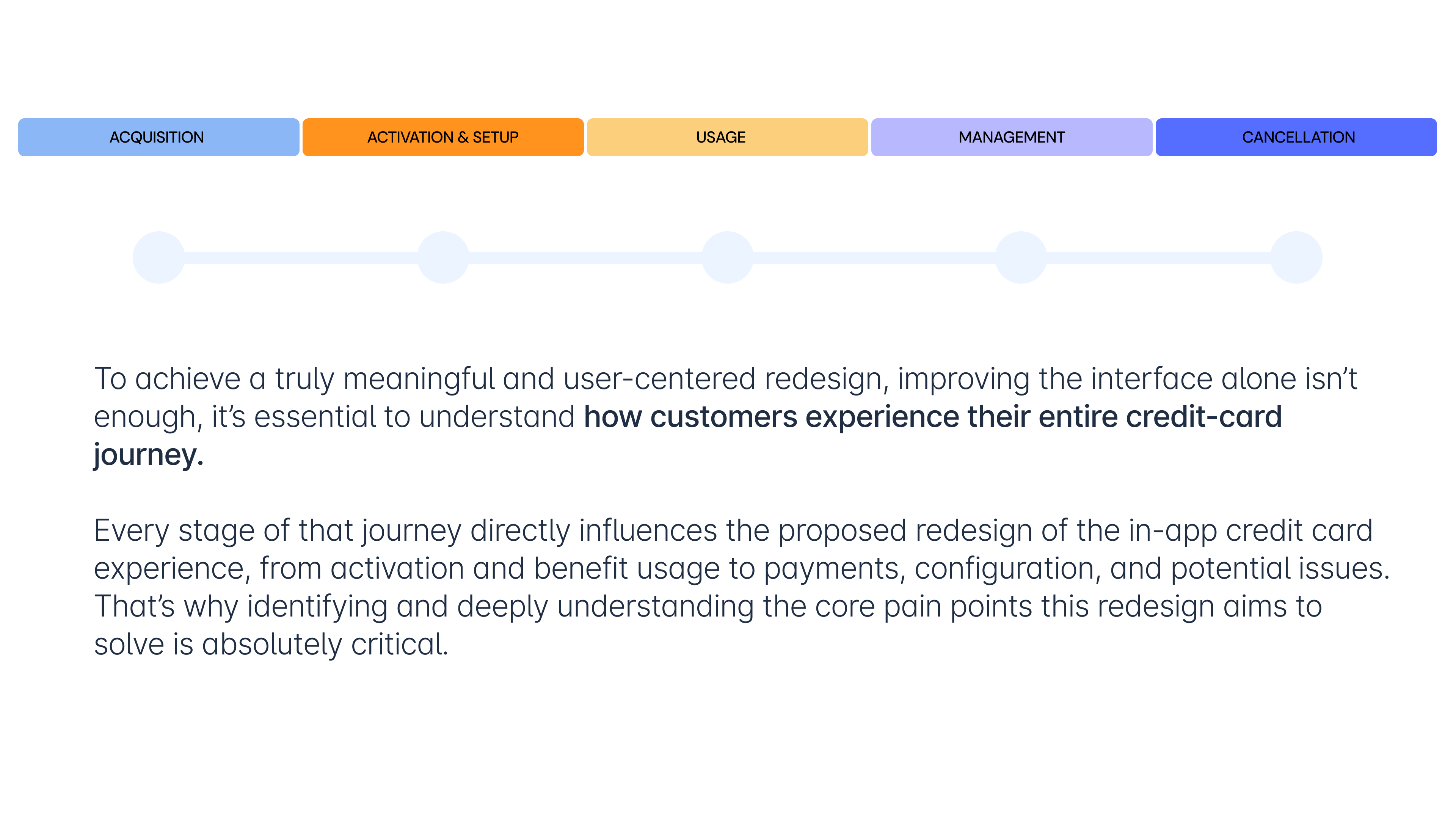
Credit Card Journeys
Acquisition Current Pain Point
To enhance the experience without neglecting users who still prefer a physical card, the proposed solution is to split the journey into two distinct phases:
1. Digital Application & Instant Activation (Main Flow)
A new, simplified, fully native flow within the app where the user can:
- Select the type of card they want.
- Accept the terms and conditions.
- Instantly activate the card.
- Create their security PIN.
- Configure usage preferences (flags).
- Link the card to mobile wallets such as Apple Pay or Google Wallet, enabling immediate use directly from their phone, without waiting for physical delivery.
2. Optional Physical Card Request (Complementary Flow)
Once the digital version is activated, the user is given the option to request a physical card only if needed, choosing between home delivery or in-branch pickup.
This approach balances speed, flexibility, and user autonomy, while aligning with business goals of activation and usage growth.
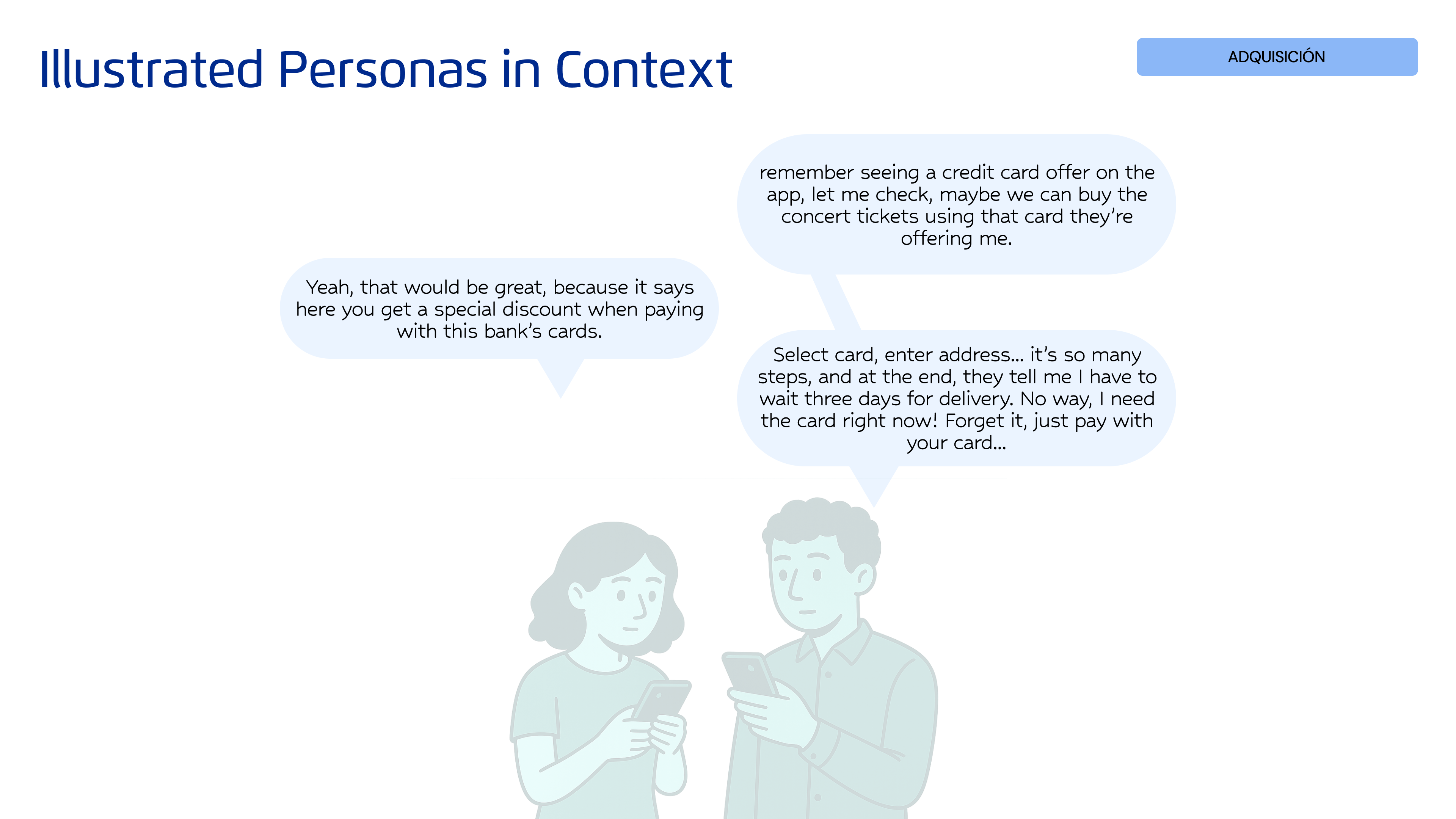
Illustrated Personas in Context
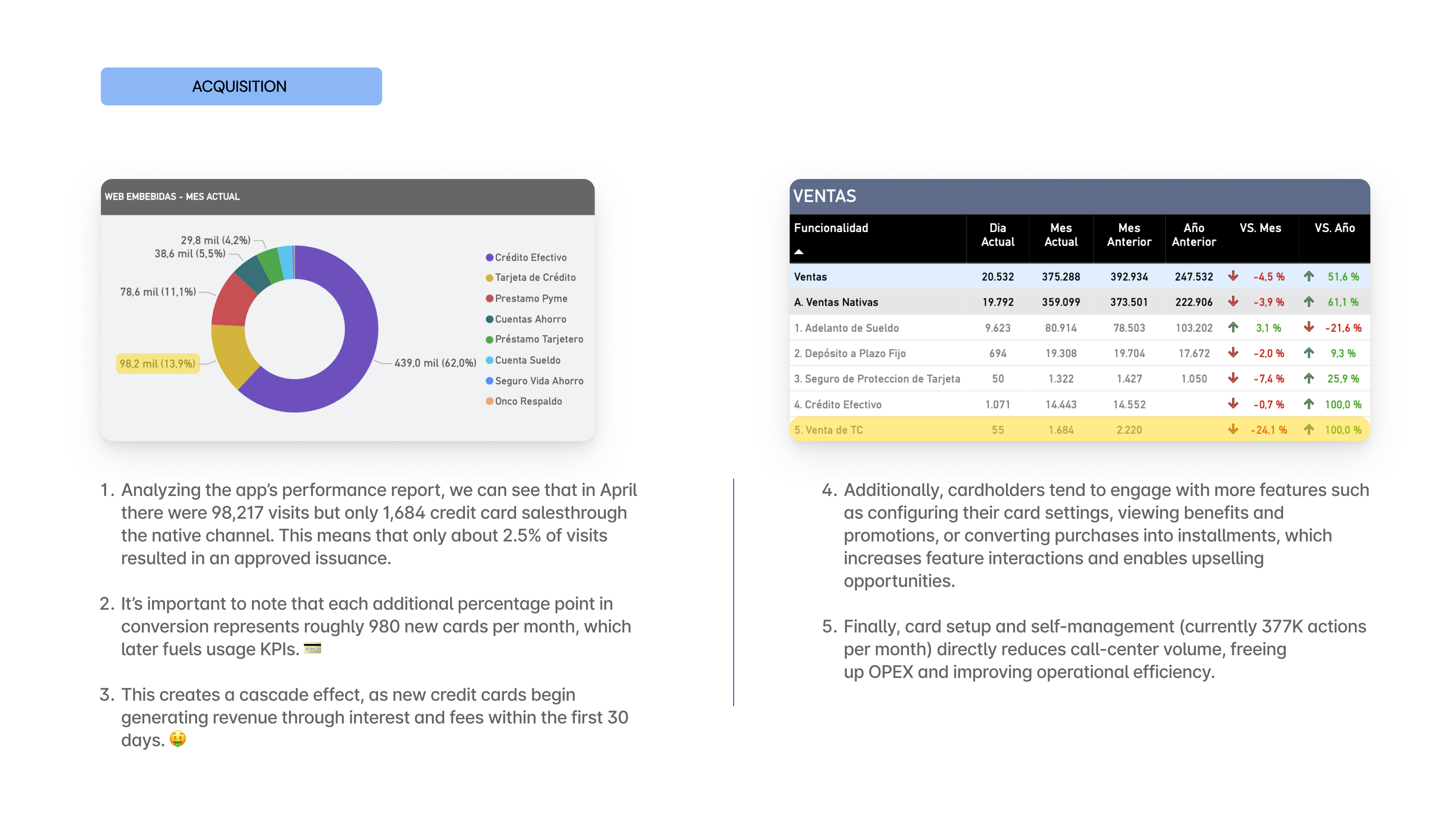
App metrics to validate this scenario
Improvement Proposal 🤩
To enhance the experience without neglecting users who still prefer a physical card, the proposed solution is to split the journey into two distinct phases:
1. Digital Application & Instant Activation (Main Flow). A new, simplified, fully native flow within the app where the user can:
- Select the type of card they want.
- Accept the terms and conditions.
- Instantly activate the card.
- Create their security PIN.
- Configure usage preferences (flags).
- Link the card to mobile wallets such as Apple Pay or Google Wallet, enabling immediate use directly from their phone, without waiting for physical delivery.
2. Optional Physical Card Request (Complementary Flow) Once the digital version is activated, the user is given the option to request a physical card only if needed choosing between home delivery or in-branch pickup.
This approach balances speed, flexibility, and user autonomy, while aligning with business goals of activation and usage growth.
Card Activation Current Pain Point
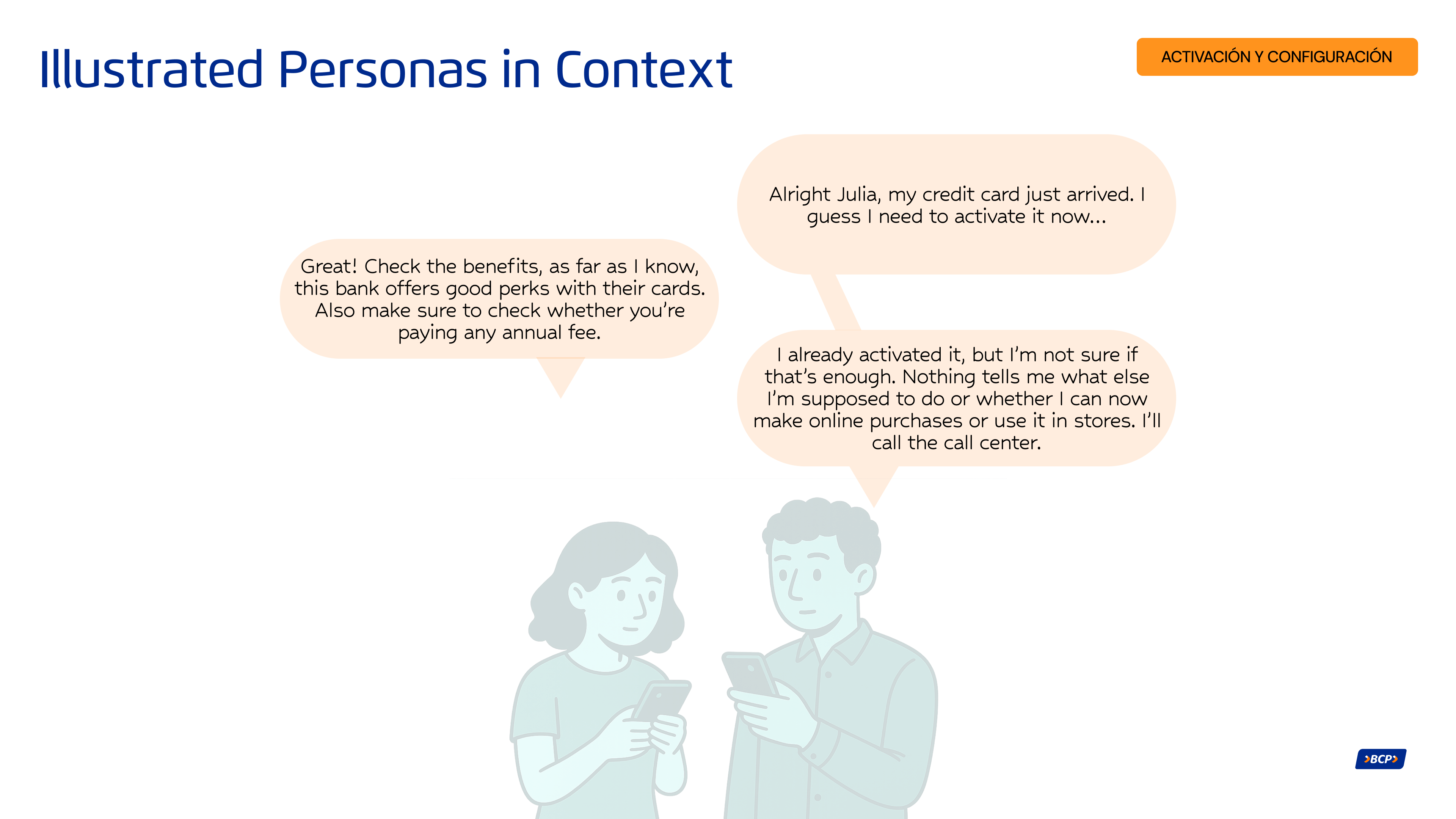
Currently, the key post-request functionalities for credit and debit cards are fragmented across different sections of the app. Once a customer requests their card, they must:
- Manually search for where to activate it
- Then find another section to create or change their PIN
- After that, navigate to a different route to configure online-purchase and international-purchase settings,
- And finally, search for where to add the card to their mobile wallet (Apple Pay or Google Wallet).
Because this process is distributed and lacks a guided, logical sequence, it creates confusion, friction, and drop-off, negatively impacting both the overall product perception and early-usage rates.
There is no integrated flow that supports the user through the activation and configuration of their credit card in a simple, connected, and intuitive way.
Illustrated Personas in Context
App metrics to validate this scenario
Improvement Proposal 🤩
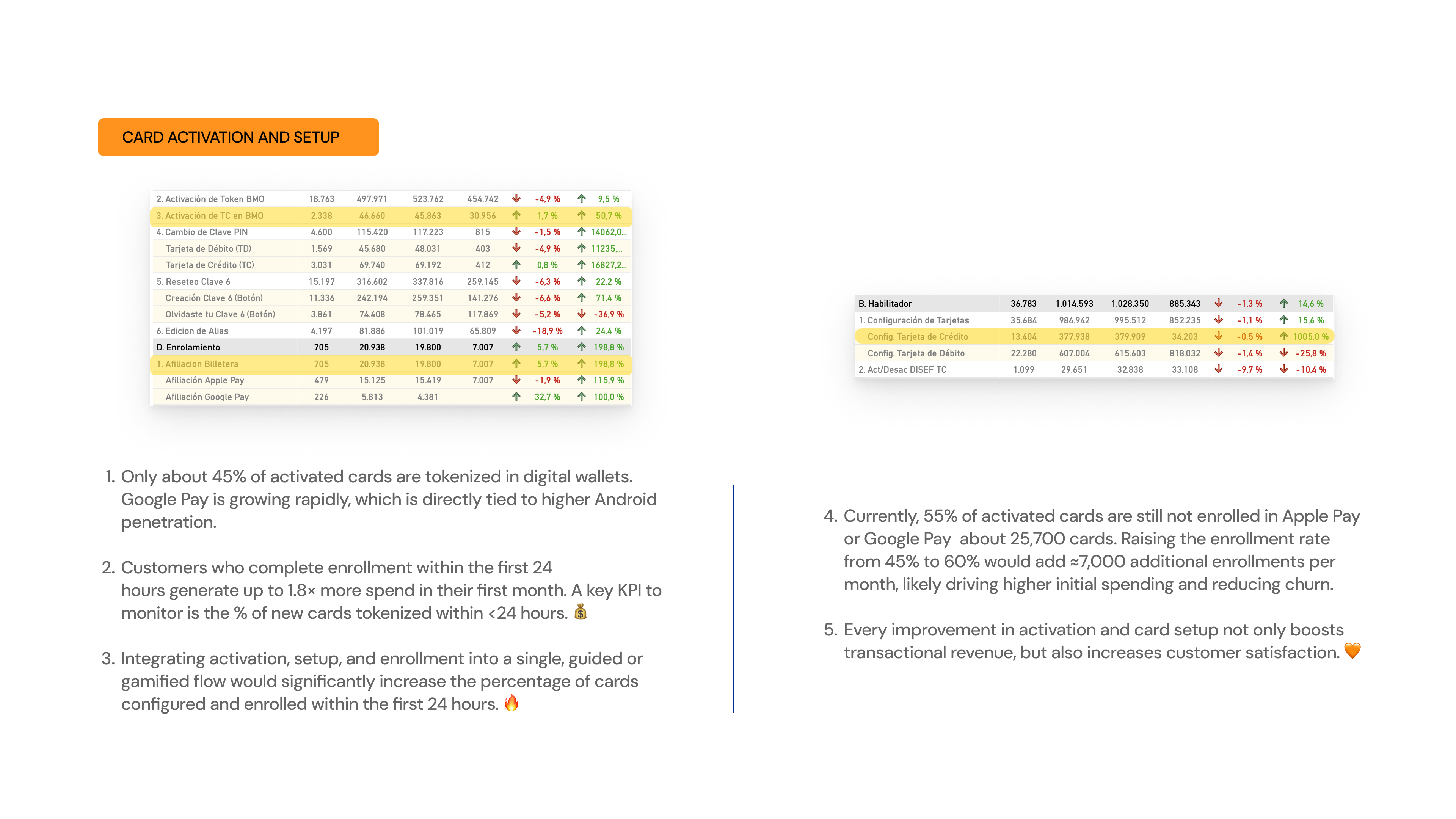
Unify all key early-stage card-management processes into a single, guided, and integrated flow, leveraging the fact that requesting a digital or virtual card is already a short and straightforward process. Instead of forcing users to navigate through multiple sections of the app, the proposal is to design a continuous, connected flow that includes:
- Requesting the virtual card
- Immediate automatic activation
- Creating the security PIN within the same flow
- Configuring usage flags (online, POS, international, withdrawals, etc.)
- Direct enrollment into Apple Pay or Google Wallet at the end
Feature usage Current Pain Point
Customers have access to exclusive benefits associated with their card, such as:
- Discounts at select restaurants
- Interest-free installment options at participating merchants
- LATAM miles that can be redeemed for flights or travel packages
- Welcome bonuses in miles or cash
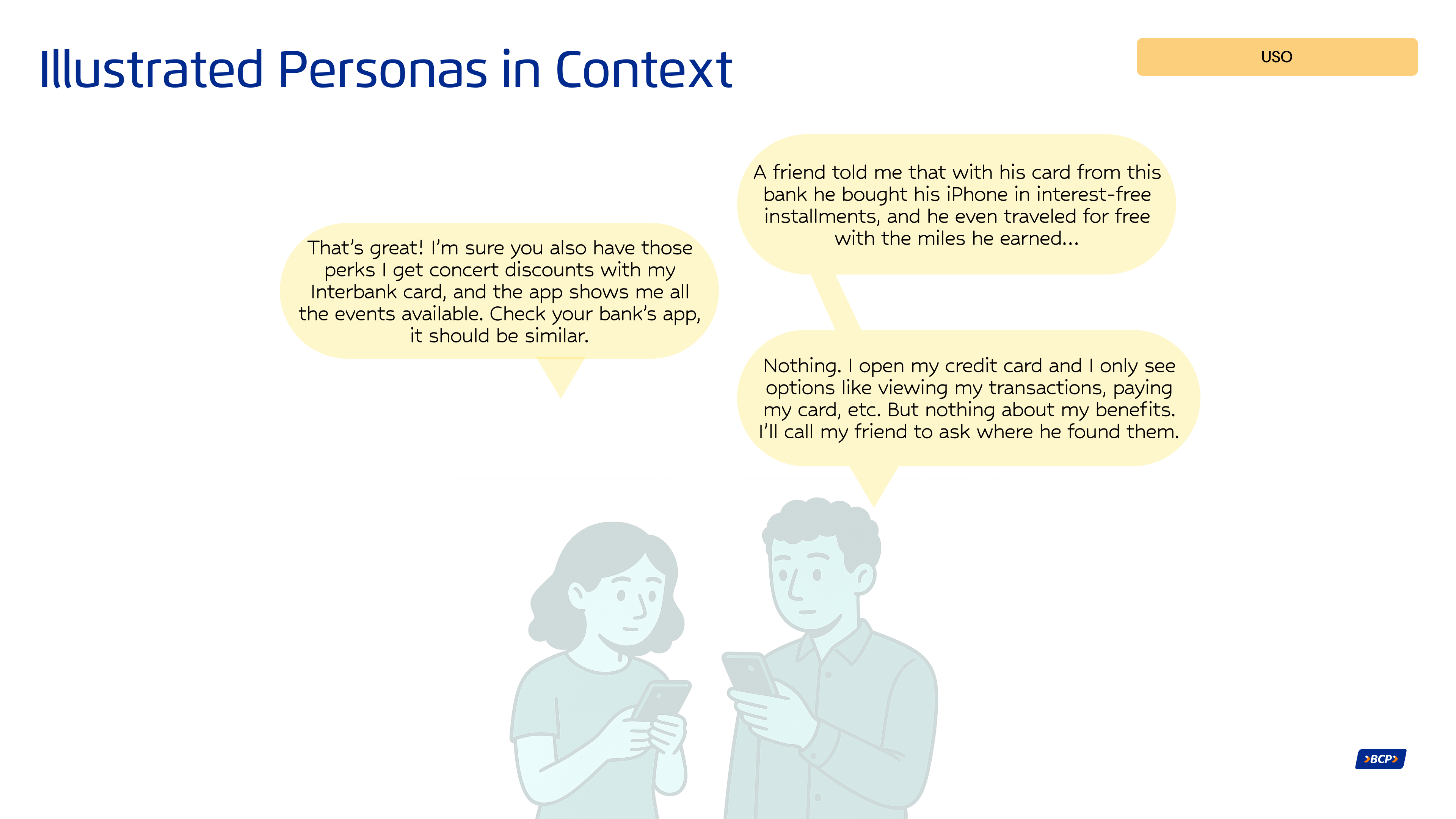
However, these benefits are not visible within the card details in the app, which means many users are unaware they exist and therefore don’t use them. This negatively impacts the perceived value of the card and reduces overall loyalty.
The app also offers useful features that allow customers to manage their spending more flexibly, such as:
- Converting individual transactions into installments
- Making targeted payments (full or partial) on already-fractioned purchases.
But these options are hidden or poorly positioned within the app, causing users to miss them or not fully understand how they work. As a result, they do not take advantage of the financial flexibility their card offers.
Illustrated Personas in Context
App metrics to validate this scenario
Improvement Proposal 🤩
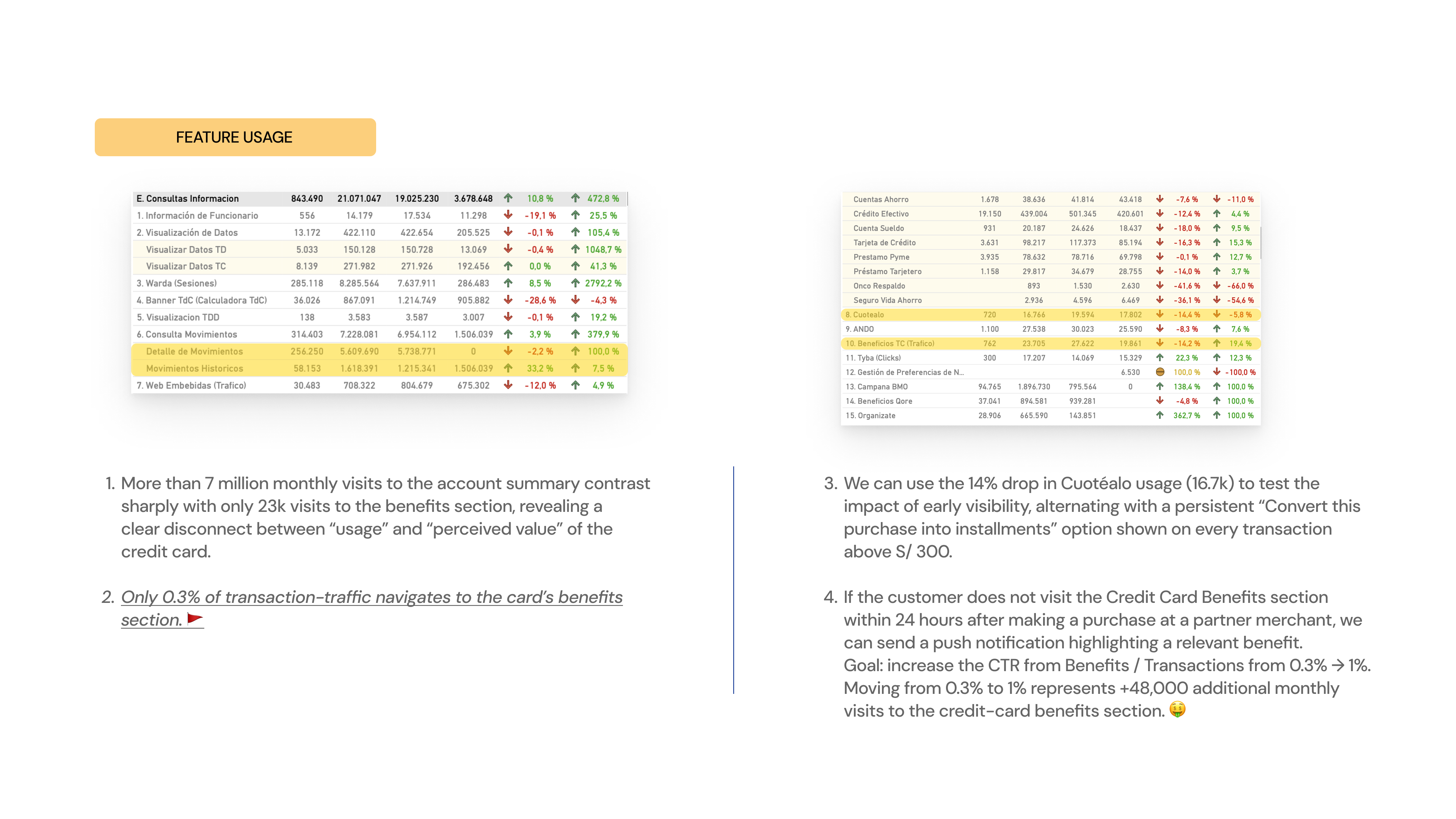
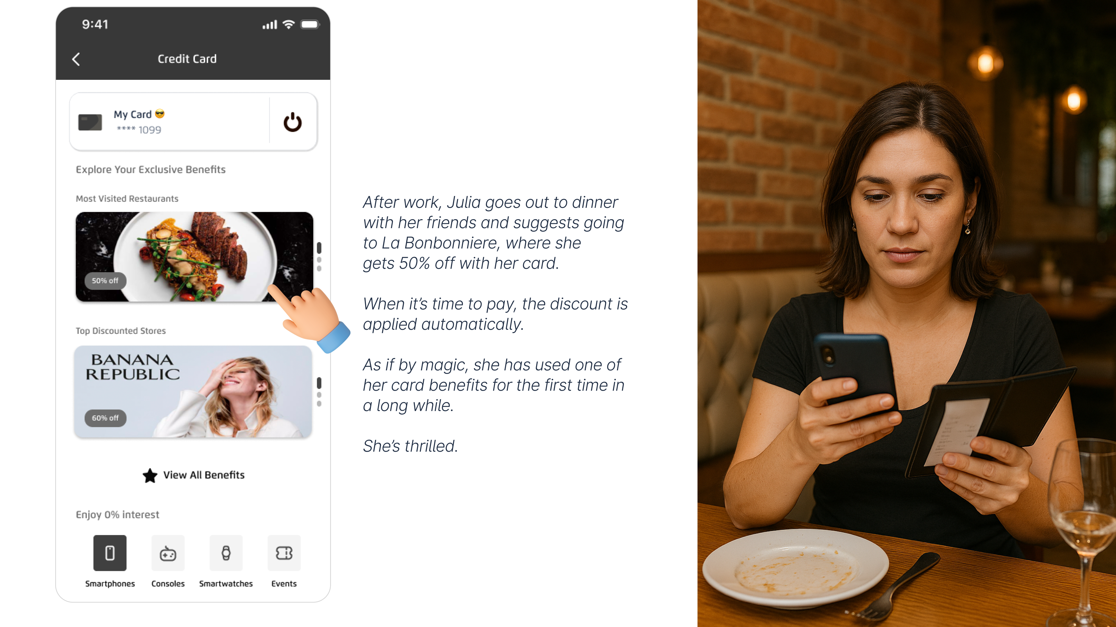
Display all credit and debit card benefits clearly and contextually, including:
- Exclusive discounts at partner restaurants and merchants
- Interest-free installment options
- LATAM miles accumulated, with the ability to redeem them directly from the app
This will help customers understand and take advantage of the card’s real value, increasing loyalty and driving more frequent usage.
Leveraging the customer’s strong financial history, the app will also present personalized and contextual opportunities such as:
- Options to increase their credit limit
- Preferred-rate loan offers using their available line
- Debt consolidation from other banks
- Invitations to apply for a second credit card based on their profile
All of this will be presented dynamically, at key moments throughout the customer’s everyday card usage.
Management Current Pain Point
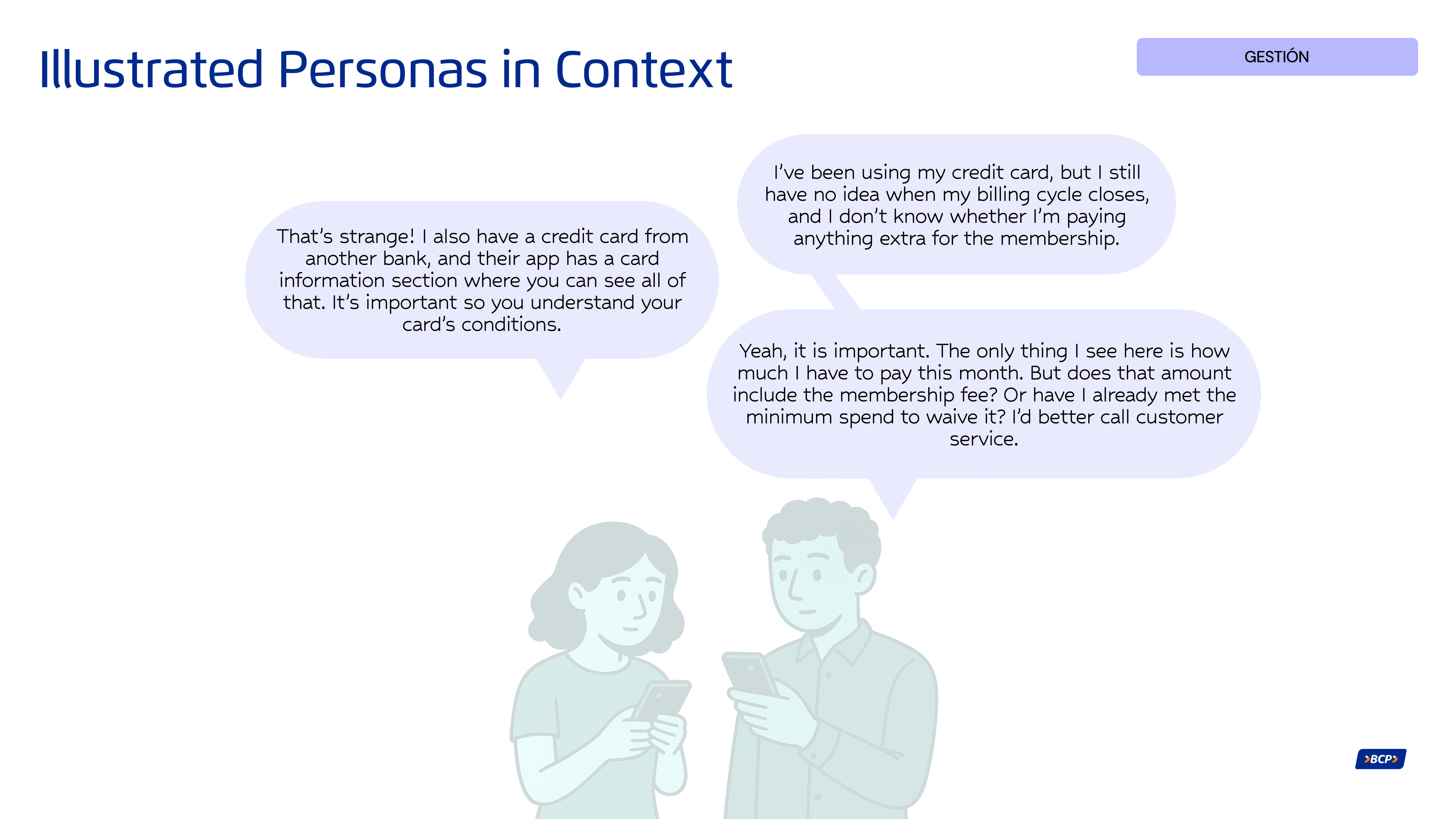
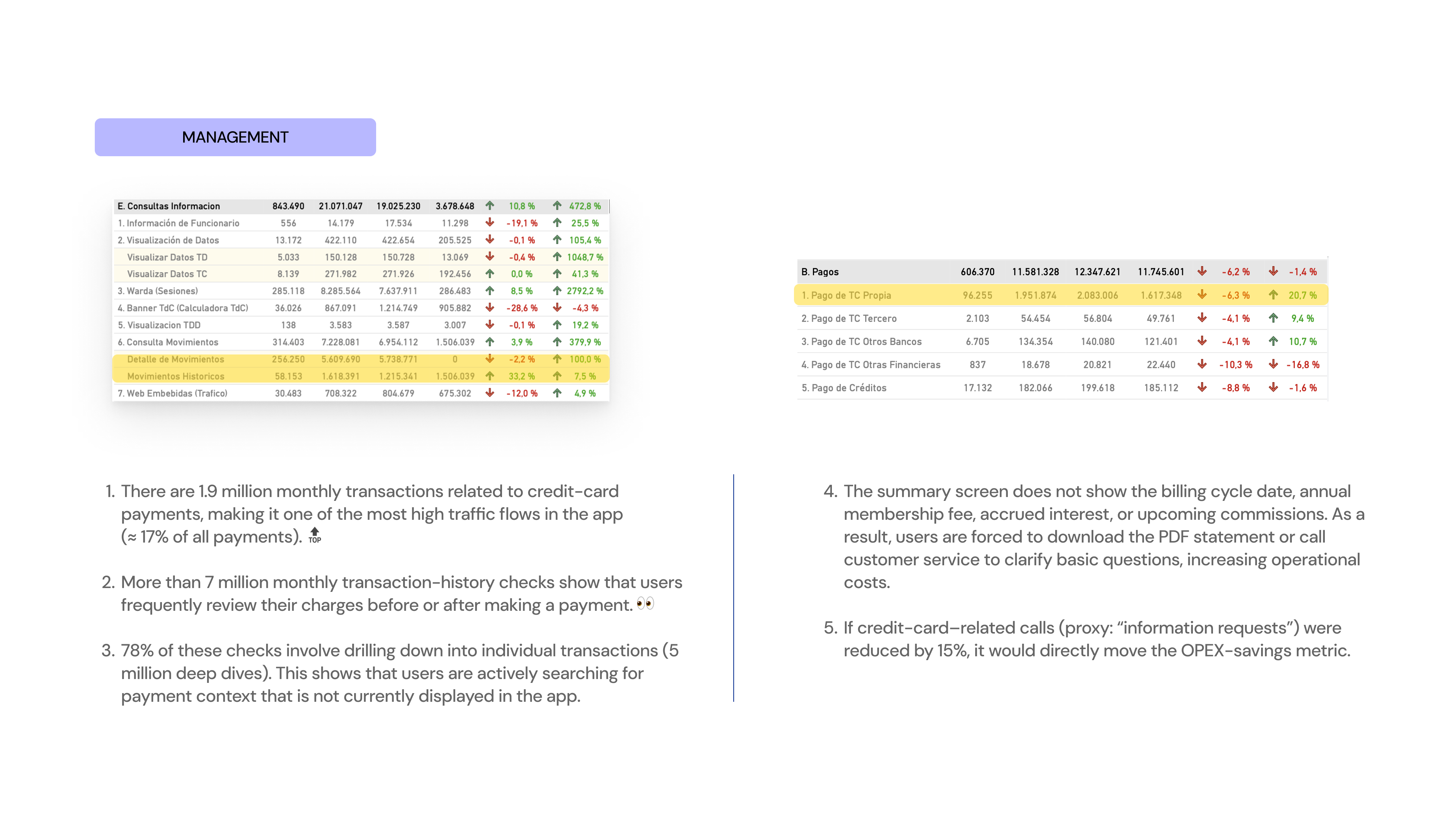
The customer does not receive contextual information indicating whether they are eligible for a card upgrade or what new benefits they would gain from making that change. This results in a flat experience with no incentives to evolve or deepen their relationship with the product.
There is no section that provides clear and easily accessible information about key product details such as:
- The interest rates associated with their card
- The annual or monthly membership fee
- Conditions for using services like Priority Pass
- Requirements for upgrades or associated insurance products
This lack of transparency limits self-service, reduces product understanding, and prevents customers from getting the most out of their card.
Illustrated Personas in Context
App metrics to validate this scenario
Improvement Proposal 🤩
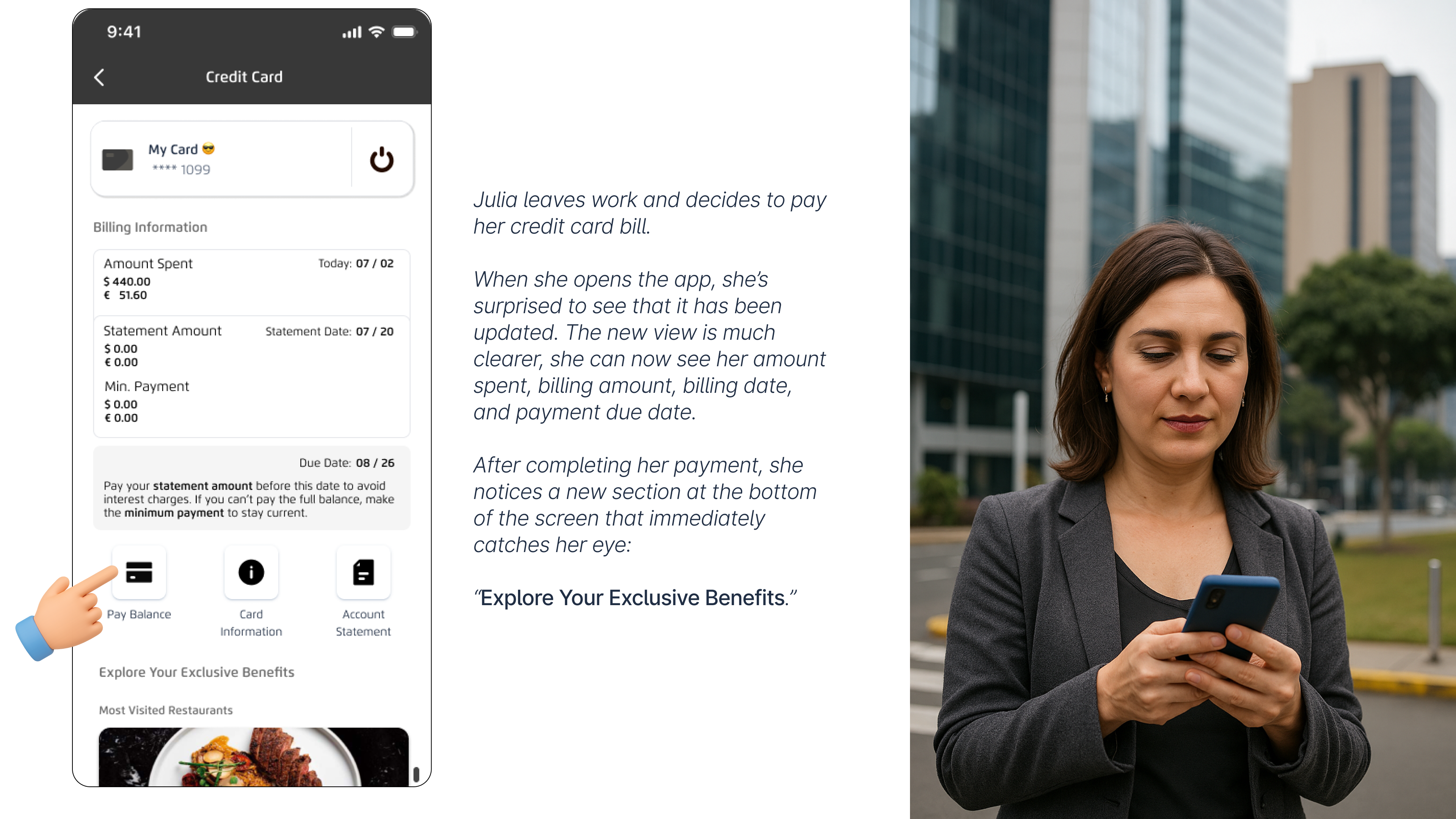
Create a main management view that clearly displays:
- Current billed amount
- Billing cycle date
- Payment due date
This view should adapt visually based on the card’s status:
- Before billing (neutral or preventive state)
- Billed (active state)
- Approaching due date (alert or warning state)
This helps users quickly understand their financial situation and make timely decisions.
When a customer becomes eligible for a card upgrade, the interface will display:
- A distinct visual indicator on their current card
- A direct entry point to view the new benefits they would unlock by upgrading
This strengthens the customer’s relationship with the product and encourages natural progression based on their profile.
Card Cancellation Current Pain Point
Customers currently do not have a dedicated flow to cancel their credit card, even though by 2025 this functionality will be mandatory across the digital channels of major banks.
However, enabling cancellation also introduces several user pains that must be explored in greater depth to fully understand them:
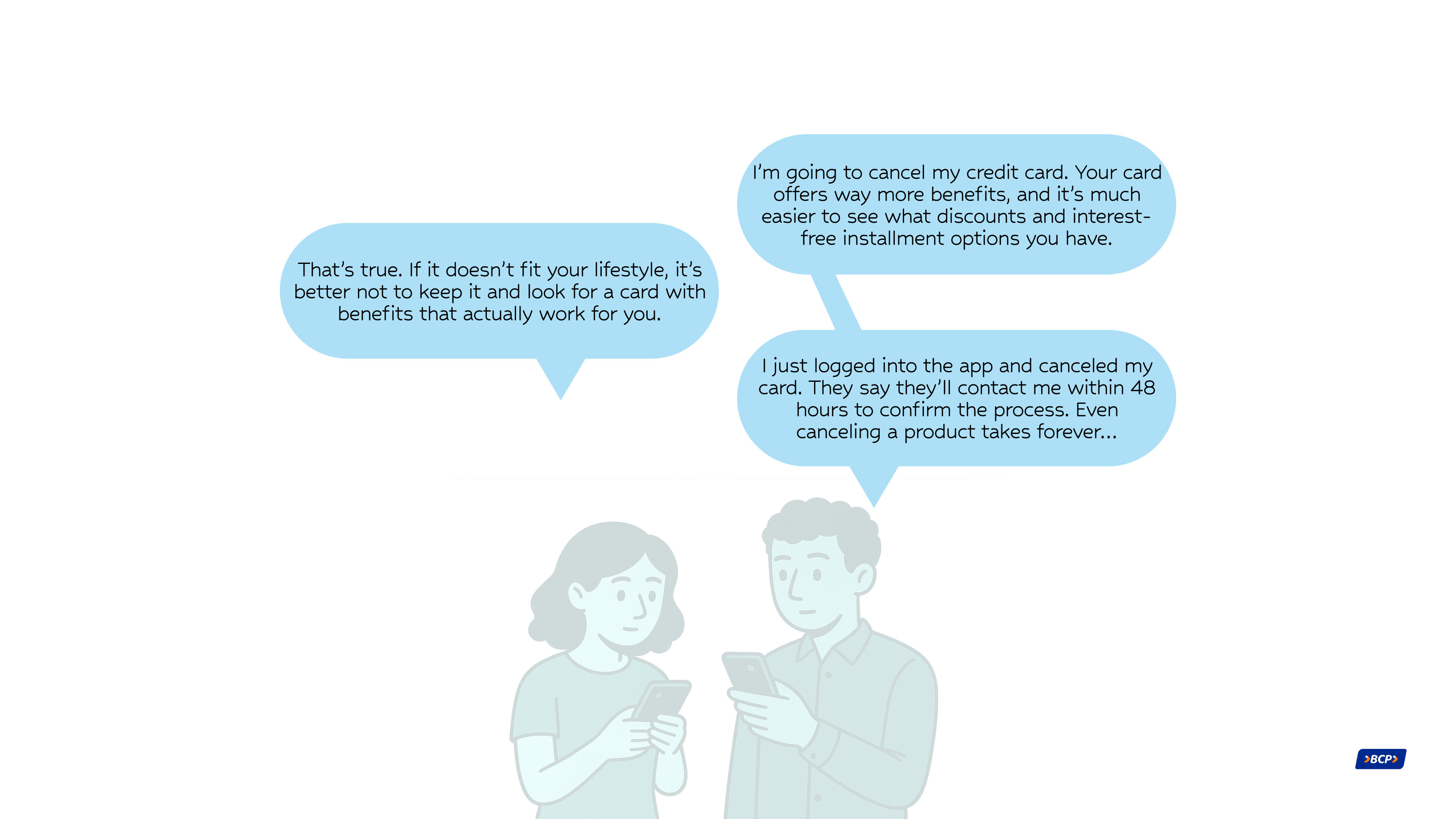
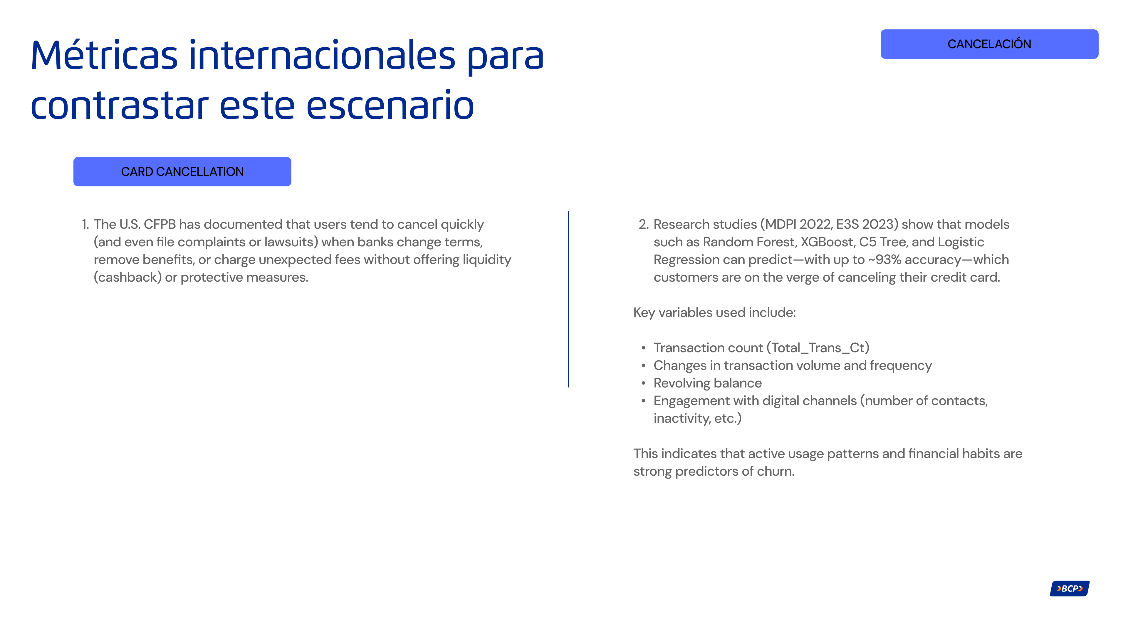
- Lack of clarity or misinformation: Many users cancel their card without knowing alternatives such as temporary freezing (ideal for travel), downgrading to a basic card, or suspending the card due to theft (instead of permanently canceling it).
- Poor experience management: Many cancellation reasons could have been prevented through proactive alerts about upcoming charges, opportunities for negotiation or retention (churn-saving offers), or unresolved negative experiences such as slow or ineffective customer service.
- Lack of actionable insight for the bank: Exit flows often provide very little context (quick buttons with no depth), and users are not given a chance to negotiate or express their motivations before completing the cancellation.
These issues directly affect the bank’s profitability, reputation, and customer loyalty.
The MVP for the credit-card cancellation flow in the app (scheduled to go live in 2025) includes an initial request that is later reviewed by a bank advisor, who decides whether to proceed directly with the cancellation or classify the customer as having retention potential, triggering outreach to attempt to retain them. This process takes approximately 48 hours, and due to the manual intervention required, the pipeline is not fully efficient.
The to-be version of this functionality proposes a more agile process by automatically assessing whether the customer is retainable, allowing the cancellation to be completed immediately. However, this new approach does not deeply explore the different scenarios behind a customer’s decision to close their account, since it does not thoroughly analyze the cancellation reason. This represents a missed opportunity, considering that in roughly 80% of cases the cancellation could be prevented if the user’s core pain point were properly identified and addressed.
Illustrated Personas in Context
App metrics to validate this scenario
Improvement Proposal 🤩
Implement a progressive, educational process that not only complies with regulations but also prevents unnecessary cancellations.
This includes displaying alternatives such as temporary freezing, card downgrade, or blocking due to theft before completing the cancellation flow; offering personalized retention options based on the customer’s specific reason; and activating proactive alerts in response to risk behaviors (such as low usage or upcoming fees).
The goal is to reduce the rate of permanent cancellations, improve the customer experience, and give the bank the ability to act before losing the user.
To enable this, the system should include:
- Predictive retention engine (ML): Identifies who is likely to cancel and why.
- Personalized decision engine (NBA): Recommends what to offer based on the customer’s profile (e.g., fee waiver vs. downgrade).
- NLP for open-text feedback: Automatically analyzes cancellation reasons to cluster them by theme and urgency.
Benchmarking
A strategic benchmarking study was conducted across:
- 8 national apps (leading Peruvian banks and fintechs)
- 17 international banking apps (from North America, Latin America, and Europe)
The objective of the analysis was to identify best practices, design patterns, and improvement opportunities within the specific user flow under evaluation.
Key Insights 🎯
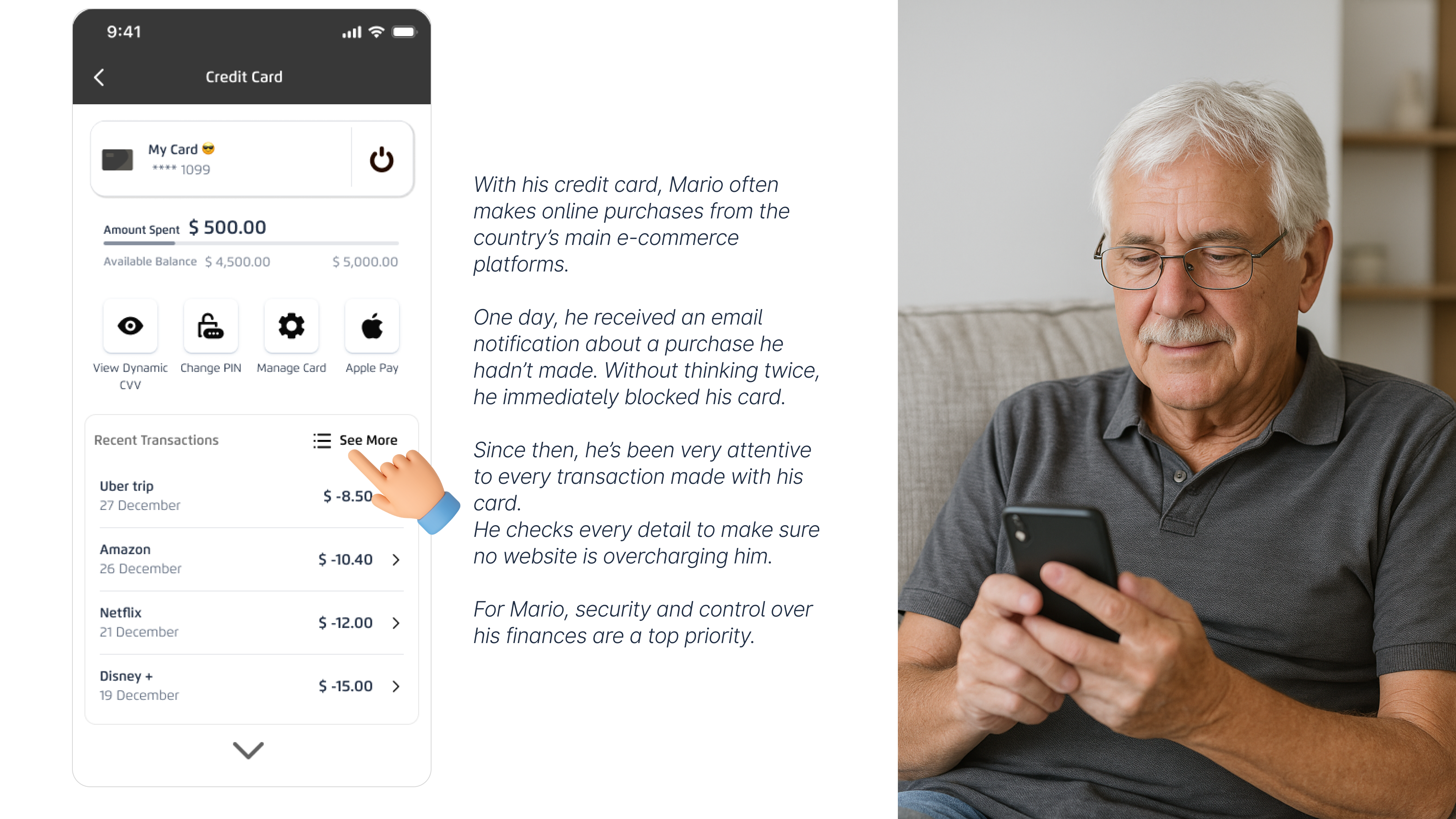
In the main card-detail view, core servicing actions are more relevant to users than the discounts or benefits associated with the card. The transaction history plays a critical role as a control and monitoring tool, meaning search and filtering must be optimized for efficiency.
Additionally, the visual design of the card consistently takes on a prominent role in the interface, even when it does not serve a directly interactive or functional purpose.
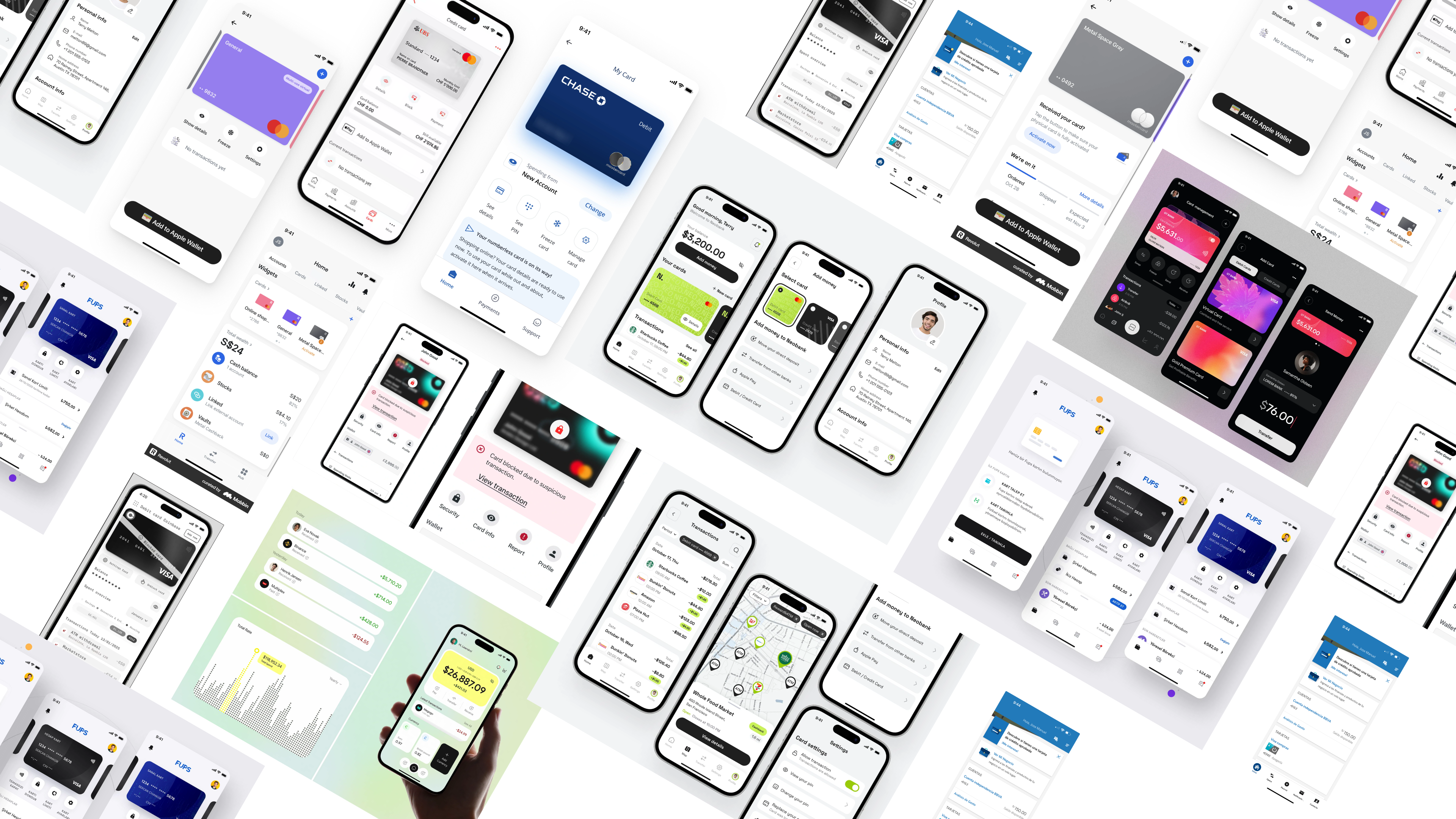
Enjoy the Credit Card Redesign
Explore the prototype
Frames
Video
Credit Card Redesign Components
This modular structure enhances navigation within a feature-rich app section, making it easier for users to explore and access key functionalities.
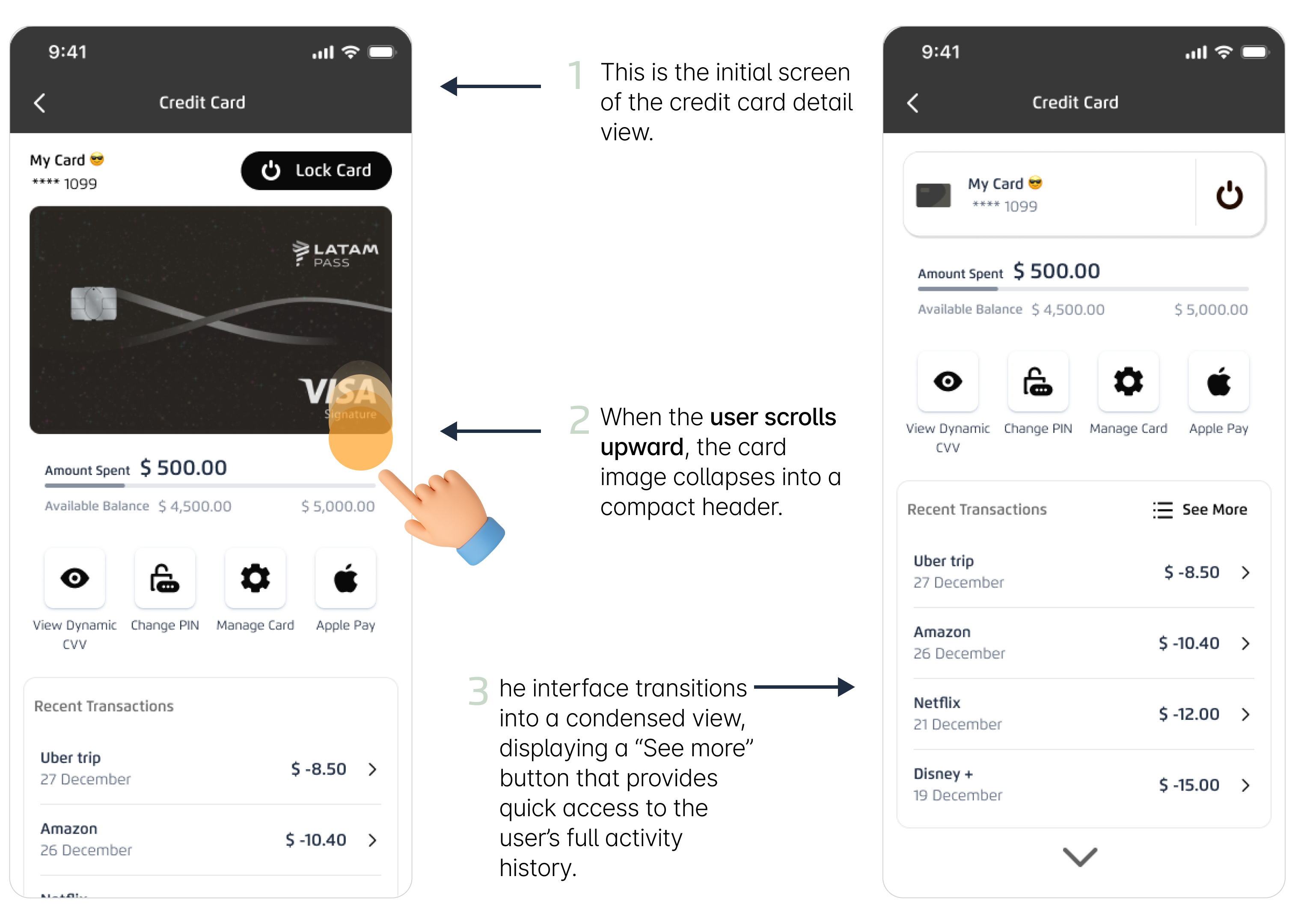
It’s important to understand how specific micro-components within the flow directly influence user orientation, sense of control, and efficiency in completing critical tasks.This section presents two key design decisions that enhance usability in the card details view: the sticky card header and the primary action placed within the header. Both elements were evaluated based on their impact on navigation, security, and quick access to essential features.
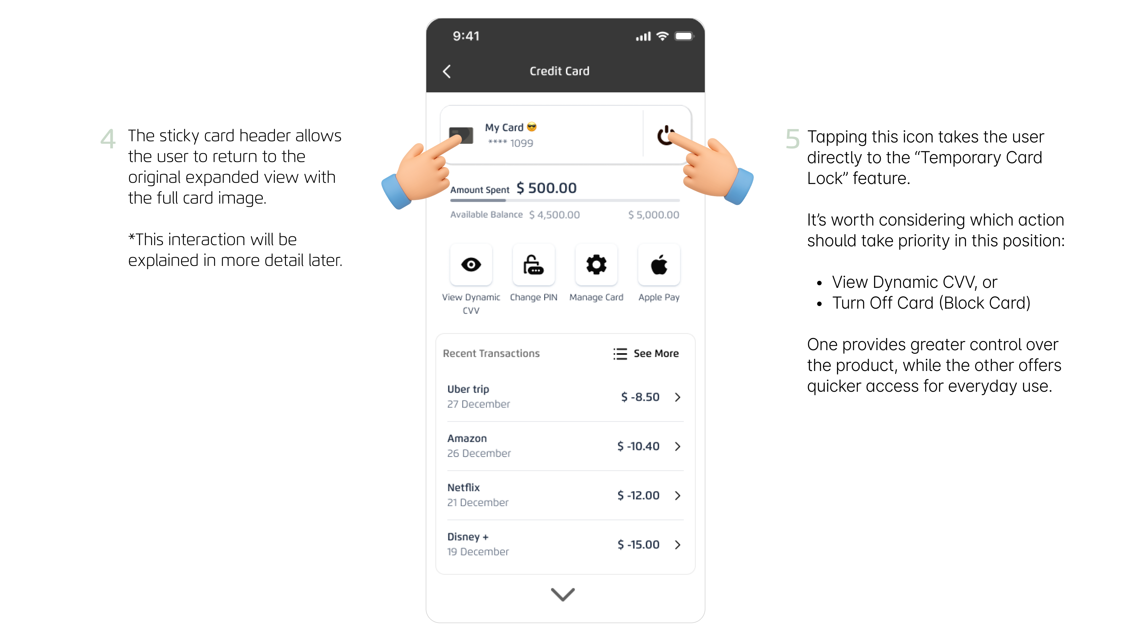
A sticky card header with tap-enabled behavior is introduced
Benefits
- Immediate access to the card statusThe user no longer needs to scroll all the way up to find the main card section.
- Stronger orientation within the flowWhether the user is exploring benefits, recent transactions, or promotions, they always know which card they are interacting with.
- Contextual navigation made simpleTapping the sticky header brings the user back to the full card view, reducing friction and improving exploration, especially when paired with snapping scroll.
- Reinforces visual associationThe user constantly sees the visual identity of their card (color, name, icon), strengthening their mental model and financial awareness.
- Instant sense of security and controlKeeping the “Turn Off Card” control visible at all times increases the user’s perception of safety and response readiness in case of fraud or mistakes.
Traditional scrolling is replaced with snapping scroll
Benefits
- Better orientation and comprehensionEach section “locks” into place, making the structure clear and predictable.
- Clear boundaries between modulesThe user easily understands where each block begins and ends: Billing, Benefits, Interest-free Installments, LATAM Pass, etc.
- Greater visual controlContent doesn’t slide abruptly or stop mid-section, preventing partial or cut-off views.
- Improved hierarchy and organizationEach module behaves like an independent card or screen, creating a cleaner and more modular experience.
- A smoother and more modern feelSnapping scroll gives the app a polished, fluid, and premium interaction style.
👎 When is traditional scrolling not recommended?
- When content mixes together without clear separation.
- When too many features appear in a long continuous stream.
- When the experience needs layered or modular feature grouping.
👍 When is traditional scrolling recommended?
- Long, continuous lists such as transaction history, notifications, or activity logs.
- Search-driven scenarios where the user wants to quickly scan or locate something specific.
General recommendations for snapping scroll in mobile apps
👴🏼 Snapping scroll for older or less tech-savvy users, can it feel complex?
This insight emerged during field-feedback testing (FF). To avoid confusion:
- Show a clear visual transitionUse smooth, progressive animations to help users understand they are moving between “screens” or “sections.”
- Label each section clearlyEvery module should have a large, readable title (e.g., Recent Transactions, Interest-Free Installments).
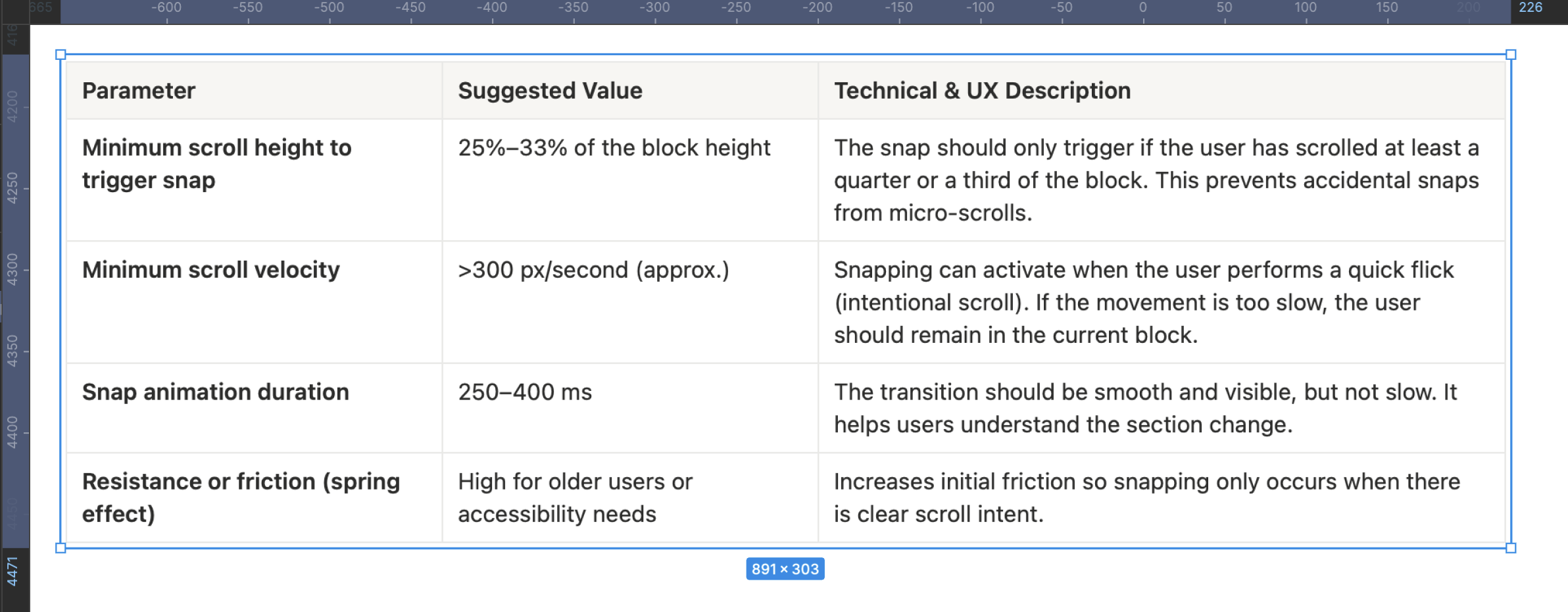
- Avoid hyper-sensitive snappingIncrease the scroll threshold so snapping occurs only with an intentional gesture.
- Provide an easy return to the topThe sticky card header plays a crucial role here, enabling quick, intuitive navigation back to the main card view.
The reference numbers (25–33% of the block, >300 px/s, 250–400 ms) are industry-aligned heuristics, derived from mobile design experience, official documentation, and accessibility/usability principles.They're not from one single source, they’re best-practice integrations applied across mobile UX.
User Story: Unlocking Hidden Card Value

User Profiling
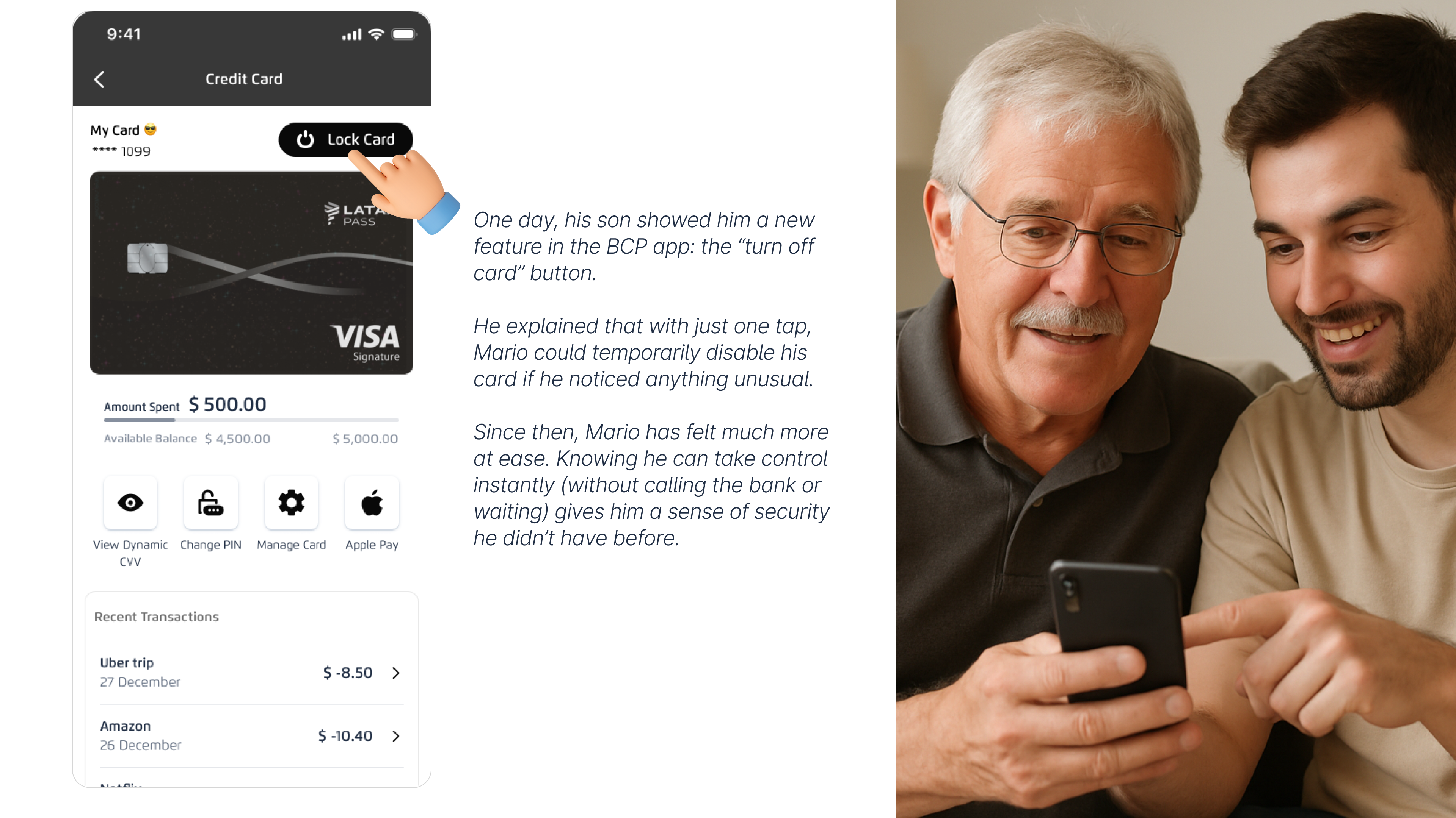
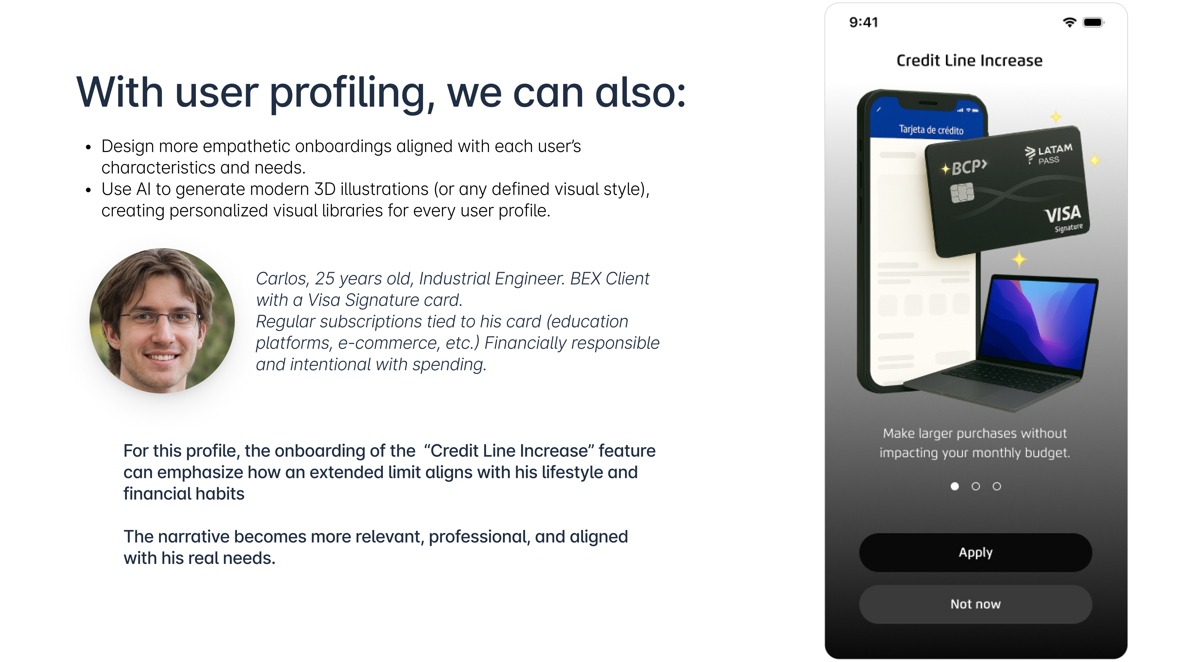
If we capture data such as a user’s monthly usage frequency, the specific features they interact with, and their general profile (age, card type, financial behavior, etc.), we gain the perfect foundation to take this banking app’s experience to a new level of personalization.
This approach allows us to dynamically adapt the interface, prioritize the most relevant modules for each user, and anticipate their needs, resulting in a more efficient, human, and context-aware experience.
Beyond enabling intelligent profile-based onboarding and personalized sections, this strategy unlocks several high-value opportunities for the app, such as:
- More transparent and segmented management of raffles, promotions, and marketing campaigns directly within the app.
- The ability to personalize digital assistants based on each user’s level of tech familiarity, making the experience more accessible and guided.
- A foundation for a gamified experience, where users progress through ranks and unlock exclusive benefits, rewarding and recognizing the most active customers (heavy users).
Learnings & Reflections
This redesign reaffirmed a fundamental truth about financial products: the quality of the user experience is directly tied to the clarity of the system behind it. What initially appeared to be a “UI challenge” quickly revealed itself as a structural, organizational, and operational problem embedded across the entire credit-card lifecycle.
Two major learnings stood out:
Fragmentation is the root cause of nearly every user and business pain: activation scattered across four sections, benefits hidden, management tools buried, and cancellation lacking any dedicated path, this fragmentation didn’t just hurt adoption; it created confusion, distrust, unnecessary calls, and an inaccurate perception of product value.
A redesign must span the entire credit-card journey, not just one screen: Every pain point in your study, acquisition, activation, usage, management, cancellation, affects the next. Treating each stage in isolation would have produced superficial improvements; mapping and designing the complete lifecycle revealed deeper opportunities.
What I’m Most Proud Of
I’m most proud of transforming a fragmented, multi-step credit-card experience into a cohesive, guided, and scalable end-to-end journey that directly connects user needs, business goals, operational efficiency, and measurable impact. Every design decision, from the unified activation flow and contextual benefits visibility to the sticky header, snapping scroll, and dynamic management states, was grounded in research, metrics, and real user behavior.
This project reshaped the product’s value perception, reduced friction, and strengthened the strategic relationship between customers and the bank.
What I Would Have Done Differently
If I were to revisit this project, I would push deeper collaboration with risk, operations, and collections earlier in the process, validate more flow variations through segmented user testing, and explore broader alternatives for benefits visibility and cancellation logic.
I would also invest in mapping a more comprehensive taxonomy of cancellation reasons to strengthen decision paths and retention opportunities, and work more closely with engineering upfront to better anticipate MIPS constraints and technical limitations that influence scalability.
What I Would Do Next
Next, I would evolve the redesigned journey into an intelligent, predictive experience by integrating behavioral analytics, AI-driven recommendations, and contextual nudges throughout the lifecycle. I would A/B test key components, activation steps, benefits surfacing, payment insights, and cancellation interventions, to continuously refine adoption and usage.
Additionally, I would extend the modular architecture of this redesign to other product lines and formalize a decision-logic framework that aligns design, engineering, and business into a single, scalable product blueprint.
2025
Redesigning a banking app to boost monthly engagement with credit card features by 60%
José Manuel Zevallos, Stanford University
Rol
Product Design
UI Design
Category
App mobile
iOS / Android
Project Type
Banking app
Redesign interface

Challenge
The current process for requesting, activating, managing, and using cards within the banking app creates friction for users and leads to a high dependency on customer support channels. Functionality is scattered and poorly structured, negatively impacting adoption, early usage, and perceived product value. This affects both the customer experience and core business objectives.
Hypothesis
If the card experience were redesigned as a connected, guided, and scalable flow integrating acquisition, activation, and initial usage friction would be reduced, digital conversion would increase, customer satisfaction would improve, and operational load on the call center would decrease.
Summary
The project focused on redesigning the credit card experience within the banking app to improve visibility, structure, and usability. The goal was to create a cohesive and intuitive flow that connects acquisition, activation, and usage stages, enabling customers to better understand and manage their cards. This initiative sought to enhance user engagement, reduce friction, and drive a measurable impact on digital adoption and operational efficiency.
Problem Users Faced
Users found it difficult to locate and understand card-related functionalities, such as activation, limit management, or payment options. The experience felt fragmented and inconsistent, leading to confusion, distrust, and frequent reliance on customer service for basic operations. This lack of clarity directly affected product perception and overall satisfaction.
Business Objective
Increase digital adoption and card feature usage by 60% through a unified, user-centered experience that reduces support dependency and boosts self-service capabilities. The redesign aimed to align customer needs with business goals, improving retention, satisfaction (CES/NPS), and revenue from card operations.
Product Owner & Business Request
The Product Owner requested a strategic redesign to consolidate all card-related features into a single, seamless interface. The business expected the new experience to reduce call center volume, strengthen engagement with digital channels, and position the credit card as a key value driver within the app ecosystem.
Applied Methodology
To approach the redesign of the cards section in this banking app, I defined a custom methodological framework that combines elements from the Double Diamond, Design Thinking and Lean UX principles. This hybrid approach allowed me to address the challenge from a strategic, systemic, and outcome-driven perspective.
Explore the final prototype
Figma
Video
This case study has been adapted for demonstration purposes only. Names, data, metrics, and specific details have been modified to protect the confidentiality of the companies involved and to avoid disclosing sensitive information. This document focuses on showcasing the strategic design process, evidence-based decision-making, and potential impact on user experience. The examples faithfully represent typical challenges without compromising the privacy of teams or real users.
Reason for the redesign
User Pain Points
Business Pain Points
- There’s limited visibility into the features that drive transactions such as mobile wallets and credit card benefits.
- The “Convert to Installments” feature (the bank’s second most profitable function) lacks an intuitive user experience.
- Users don’t perceive a clear order or structure among the servicing features available for their cards.
- High-value leads like credit line increases, cash advances using the card’s available line, and debt consolidation from other banks need to be presented more contextually. They should feel relevant and helpful to the user, rather than purely sales-driven, to avoid friction or rejection.
Channel/App Pain Points
- All card-related services cannot be loaded within a single screen or section, as it’s not efficient or scalable (due to high MIPS consumption).
Credit Card Journeys

Acquisition Current Pain Point
To enhance the experience without neglecting users who still prefer a physical card, the proposed solution is to split the journey into two distinct phases:
1. Digital Application & Instant Activation (Main Flow)
A new, simplified, fully native flow within the app where the user can:
- Select the type of card they want.
- Accept the terms and conditions.
- Instantly activate the card.
- Create their security PIN.
- Configure usage preferences (flags).
- Link the card to mobile wallets such as Apple Pay or Google Wallet, enabling immediate use directly from their phone, without waiting for physical delivery.
2. Optional Physical Card Request (Complementary Flow)
Once the digital version is activated, the user is given the option to request a physical card only if needed, choosing between home delivery or in-branch pickup.
This approach balances speed, flexibility, and user autonomy, while aligning with business goals of activation and usage growth.
Illustrated Personas in Context

App metrics to validate this scenario

Improvement Proposal 🤩
To enhance the experience without neglecting users who still prefer a physical card, the proposed solution is to split the journey into two distinct phases:
1. Digital Application & Instant Activation (Main Flow). A new, simplified, fully native flow within the app where the user can:
- Select the type of card they want.
- Accept the terms and conditions.
- Instantly activate the card.
- Create their security PIN.
- Configure usage preferences (flags).
- Link the card to mobile wallets such as Apple Pay or Google Wallet, enabling immediate use directly from their phone, without waiting for physical delivery.
2. Optional Physical Card Request (Complementary Flow) Once the digital version is activated, the user is given the option to request a physical card only if needed choosing between home delivery or in-branch pickup.
This approach balances speed, flexibility, and user autonomy, while aligning with business goals of activation and usage growth.
Card Activation Current Pain Point
Currently, the key post-request functionalities for credit and debit cards are fragmented across different sections of the app. Once a customer requests their card, they must:
- Manually search for where to activate it
- Then find another section to create or change their PIN
- After that, navigate to a different route to configure online-purchase and international-purchase settings,
- And finally, search for where to add the card to their mobile wallet (Apple Pay or Google Wallet).
Because this process is distributed and lacks a guided, logical sequence, it creates confusion, friction, and drop-off, negatively impacting both the overall product perception and early-usage rates.
There is no integrated flow that supports the user through the activation and configuration of their credit card in a simple, connected, and intuitive way.
Illustrated Personas in Context

App metrics to validate this scenario

Improvement Proposal 🤩
Unify all key early-stage card-management processes into a single, guided, and integrated flow, leveraging the fact that requesting a digital or virtual card is already a short and straightforward process. Instead of forcing users to navigate through multiple sections of the app, the proposal is to design a continuous, connected flow that includes:
- Requesting the virtual card
- Immediate automatic activation
- Creating the security PIN within the same flow
- Configuring usage flags (online, POS, international, withdrawals, etc.)
- Direct enrollment into Apple Pay or Google Wallet at the end
Feature usage Current Pain Point
Customers have access to exclusive benefits associated with their card, such as:
- Discounts at select restaurants
- Interest-free installment options at participating merchants
- LATAM miles that can be redeemed for flights or travel packages
- Welcome bonuses in miles or cash
However, these benefits are not visible within the card details in the app, which means many users are unaware they exist and therefore don’t use them. This negatively impacts the perceived value of the card and reduces overall loyalty.
The app also offers useful features that allow customers to manage their spending more flexibly, such as:
- Converting individual transactions into installments
- Making targeted payments (full or partial) on already-fractioned purchases.
But these options are hidden or poorly positioned within the app, causing users to miss them or not fully understand how they work. As a result, they do not take advantage of the financial flexibility their card offers.
Illustrated Personas in Context

App metrics to validate this scenario

Improvement Proposal 🤩
Display all credit and debit card benefits clearly and contextually, including:
- Exclusive discounts at partner restaurants and merchants
- Interest-free installment options
- LATAM miles accumulated, with the ability to redeem them directly from the app
This will help customers understand and take advantage of the card’s real value, increasing loyalty and driving more frequent usage.
Leveraging the customer’s strong financial history, the app will also present personalized and contextual opportunities such as:
- Options to increase their credit limit
- Preferred-rate loan offers using their available line
- Debt consolidation from other banks
- Invitations to apply for a second credit card based on their profile
All of this will be presented dynamically, at key moments throughout the customer’s everyday card usage.
Management Current Pain Point
The customer does not receive contextual information indicating whether they are eligible for a card upgrade or what new benefits they would gain from making that change. This results in a flat experience with no incentives to evolve or deepen their relationship with the product.
There is no section that provides clear and easily accessible information about key product details such as:
- The interest rates associated with their card
- The annual or monthly membership fee
- Conditions for using services like Priority Pass
- Requirements for upgrades or associated insurance products
This lack of transparency limits self-service, reduces product understanding, and prevents customers from getting the most out of their card.
Illustrated Personas in Context

App metrics to validate this scenario

Improvement Proposal 🤩
Create a main management view that clearly displays:
- Current billed amount
- Billing cycle date
- Payment due date
This view should adapt visually based on the card’s status:
- Before billing (neutral or preventive state)
- Billed (active state)
- Approaching due date (alert or warning state)
This helps users quickly understand their financial situation and make timely decisions.
When a customer becomes eligible for a card upgrade, the interface will display:
- A distinct visual indicator on their current card
- A direct entry point to view the new benefits they would unlock by upgrading
This strengthens the customer’s relationship with the product and encourages natural progression based on their profile.
Card Cancellation Current Pain Point
Customers currently do not have a dedicated flow to cancel their credit card, even though by 2025 this functionality will be mandatory across the digital channels of major banks.
However, enabling cancellation also introduces several user pains that must be explored in greater depth to fully understand them:
- Lack of clarity or misinformation: Many users cancel their card without knowing alternatives such as temporary freezing (ideal for travel), downgrading to a basic card, or suspending the card due to theft (instead of permanently canceling it).
- Poor experience management: Many cancellation reasons could have been prevented through proactive alerts about upcoming charges, opportunities for negotiation or retention (churn-saving offers), or unresolved negative experiences such as slow or ineffective customer service.
- Lack of actionable insight for the bank: Exit flows often provide very little context (quick buttons with no depth), and users are not given a chance to negotiate or express their motivations before completing the cancellation.
These issues directly affect the bank’s profitability, reputation, and customer loyalty.
The MVP for the credit-card cancellation flow in the app (scheduled to go live in 2025) includes an initial request that is later reviewed by a bank advisor, who decides whether to proceed directly with the cancellation or classify the customer as having retention potential, triggering outreach to attempt to retain them. This process takes approximately 48 hours, and due to the manual intervention required, the pipeline is not fully efficient.
The to-be version of this functionality proposes a more agile process by automatically assessing whether the customer is retainable, allowing the cancellation to be completed immediately. However, this new approach does not deeply explore the different scenarios behind a customer’s decision to close their account, since it does not thoroughly analyze the cancellation reason. This represents a missed opportunity, considering that in roughly 80% of cases the cancellation could be prevented if the user’s core pain point were properly identified and addressed.
Illustrated Personas in Context

App metrics to validate this scenario

Improvement Proposal 🤩
Implement a progressive, educational process that not only complies with regulations but also prevents unnecessary cancellations.
This includes displaying alternatives such as temporary freezing, card downgrade, or blocking due to theft before completing the cancellation flow; offering personalized retention options based on the customer’s specific reason; and activating proactive alerts in response to risk behaviors (such as low usage or upcoming fees).
The goal is to reduce the rate of permanent cancellations, improve the customer experience, and give the bank the ability to act before losing the user.
To enable this, the system should include:
- Predictive retention engine (ML): Identifies who is likely to cancel and why.
- Personalized decision engine (NBA): Recommends what to offer based on the customer’s profile (e.g., fee waiver vs. downgrade).
- NLP for open-text feedback: Automatically analyzes cancellation reasons to cluster them by theme and urgency.
Benchmarking
A strategic benchmarking study was conducted across:
- 8 national apps (leading Peruvian banks and fintechs)
- 17 international banking apps (from North America, Latin America, and Europe)
The objective of the analysis was to identify best practices, design patterns, and improvement opportunities within the specific user flow under evaluation.
Key Insights 🎯
In the main card-detail view, core servicing actions are more relevant to users than the discounts or benefits associated with the card. The transaction history plays a critical role as a control and monitoring tool, meaning search and filtering must be optimized for efficiency.
Additionally, the visual design of the card consistently takes on a prominent role in the interface, even when it does not serve a directly interactive or functional purpose.

Enjoy the Credit Card Redesign
Explore the prototype
Frames
Video
Credit Card Redesign Components
This modular structure enhances navigation within a feature-rich app section, making it easier for users to explore and access key functionalities.

It’s important to understand how specific micro-components within the flow directly influence user orientation, sense of control, and efficiency in completing critical tasks.This section presents two key design decisions that enhance usability in the card details view: the sticky card header and the primary action placed within the header. Both elements were evaluated based on their impact on navigation, security, and quick access to essential features.

A sticky card header with tap-enabled behavior is introduced
Benefits
- Immediate access to the card statusThe user no longer needs to scroll all the way up to find the main card section.
- Stronger orientation within the flowWhether the user is exploring benefits, recent transactions, or promotions, they always know which card they are interacting with.
- Contextual navigation made simpleTapping the sticky header brings the user back to the full card view, reducing friction and improving exploration, especially when paired with snapping scroll.
- Reinforces visual associationThe user constantly sees the visual identity of their card (color, name, icon), strengthening their mental model and financial awareness.
- Instant sense of security and controlKeeping the “Turn Off Card” control visible at all times increases the user’s perception of safety and response readiness in case of fraud or mistakes.
Traditional scrolling is replaced with snapping scroll
Benefits
- Better orientation and comprehensionEach section “locks” into place, making the structure clear and predictable.
- Clear boundaries between modulesThe user easily understands where each block begins and ends: Billing, Benefits, Interest-free Installments, LATAM Pass, etc.
- Greater visual controlContent doesn’t slide abruptly or stop mid-section, preventing partial or cut-off views.
- Improved hierarchy and organizationEach module behaves like an independent card or screen, creating a cleaner and more modular experience.
- A smoother and more modern feelSnapping scroll gives the app a polished, fluid, and premium interaction style.
👎 When is traditional scrolling not recommended?
- When content mixes together without clear separation.
- When too many features appear in a long continuous stream.
- When the experience needs layered or modular feature grouping.
👍 When is traditional scrolling recommended?
- Long, continuous lists such as transaction history, notifications, or activity logs.
- Search-driven scenarios where the user wants to quickly scan or locate something specific.
General recommendations for snapping scroll in mobile apps
👴🏼 Snapping scroll for older or less tech-savvy users, can it feel complex?
This insight emerged during field-feedback testing (FF). To avoid confusion:
- Show a clear visual transitionUse smooth, progressive animations to help users understand they are moving between “screens” or “sections.”
- Label each section clearlyEvery module should have a large, readable title (e.g., Recent Transactions, Interest-Free Installments).
- Avoid hyper-sensitive snappingIncrease the scroll threshold so snapping occurs only with an intentional gesture.
- Provide an easy return to the topThe sticky card header plays a crucial role here, enabling quick, intuitive navigation back to the main card view.
The reference numbers (25–33% of the block, >300 px/s, 250–400 ms) are industry-aligned heuristics, derived from mobile design experience, official documentation, and accessibility/usability principles.They're not from one single source, they’re best-practice integrations applied across mobile UX.

User Story: Unlocking Hidden Card Value


User Profiling
If we capture data such as a user’s monthly usage frequency, the specific features they interact with, and their general profile (age, card type, financial behavior, etc.), we gain the perfect foundation to take this banking app’s experience to a new level of personalization.
This approach allows us to dynamically adapt the interface, prioritize the most relevant modules for each user, and anticipate their needs, resulting in a more efficient, human, and context-aware experience.
Beyond enabling intelligent profile-based onboarding and personalized sections, this strategy unlocks several high-value opportunities for the app, such as:
- More transparent and segmented management of raffles, promotions, and marketing campaigns directly within the app.
- The ability to personalize digital assistants based on each user’s level of tech familiarity, making the experience more accessible and guided.
- A foundation for a gamified experience, where users progress through ranks and unlock exclusive benefits, rewarding and recognizing the most active customers (heavy users).

Learnings & Reflections
This redesign reaffirmed a fundamental truth about financial products: the quality of the user experience is directly tied to the clarity of the system behind it. What initially appeared to be a “UI challenge” quickly revealed itself as a structural, organizational, and operational problem embedded across the entire credit-card lifecycle.
Two major learnings stood out:
Fragmentation is the root cause of nearly every user and business pain: activation scattered across four sections, benefits hidden, management tools buried, and cancellation lacking any dedicated path, this fragmentation didn’t just hurt adoption; it created confusion, distrust, unnecessary calls, and an inaccurate perception of product value.
A redesign must span the entire credit-card journey, not just one screen: Every pain point in your study, acquisition, activation, usage, management, cancellation, affects the next. Treating each stage in isolation would have produced superficial improvements; mapping and designing the complete lifecycle revealed deeper opportunities.
What I’m Most Proud Of
I’m most proud of transforming a fragmented, multi-step credit-card experience into a cohesive, guided, and scalable end-to-end journey that directly connects user needs, business goals, operational efficiency, and measurable impact. Every design decision, from the unified activation flow and contextual benefits visibility to the sticky header, snapping scroll, and dynamic management states, was grounded in research, metrics, and real user behavior.
This project reshaped the product’s value perception, reduced friction, and strengthened the strategic relationship between customers and the bank.
What I Would Have Done Differently
If I were to revisit this project, I would push deeper collaboration with risk, operations, and collections earlier in the process, validate more flow variations through segmented user testing, and explore broader alternatives for benefits visibility and cancellation logic.
I would also invest in mapping a more comprehensive taxonomy of cancellation reasons to strengthen decision paths and retention opportunities, and work more closely with engineering upfront to better anticipate MIPS constraints and technical limitations that influence scalability.
What I Would Do Next
Next, I would evolve the redesigned journey into an intelligent, predictive experience by integrating behavioral analytics, AI-driven recommendations, and contextual nudges throughout the lifecycle. I would A/B test key components, activation steps, benefits surfacing, payment insights, and cancellation interventions, to continuously refine adoption and usage.
Additionally, I would extend the modular architecture of this redesign to other product lines and formalize a decision-logic framework that aligns design, engineering, and business into a single, scalable product blueprint.
Professional website of José Manuel Zevallos
Digital Media Designer © 2025. All rights reserved.
zevallosj147@gmail.com
LinkedIn: in/jmanuelzevallos
2025
Redesigning a banking app to boost monthly engagement with credit card features by 60%
José Manuel Zevallos, Stanford University

Challenge
The current process for requesting, activating, managing, and using cards within the banking app creates friction for users and leads to a high dependency on customer support channels. Functionality is scattered and poorly structured, negatively impacting adoption, early usage, and perceived product value. This affects both the customer experience and core business objectives.
Hypothesis
If the card experience were redesigned as a connected, guided, and scalable flow integrating acquisition, activation, and initial usage friction would be reduced, digital conversion would increase, customer satisfaction would improve, and operational load on the call center would decrease.
Summary
The project focused on redesigning the credit card experience within the banking app to improve visibility, structure, and usability. The goal was to create a cohesive and intuitive flow that connects acquisition, activation, and usage stages, enabling customers to better understand and manage their cards. This initiative sought to enhance user engagement, reduce friction, and drive a measurable impact on digital adoption and operational efficiency.
Problem Users Faced
Users found it difficult to locate and understand card-related functionalities, such as activation, limit management, or payment options. The experience felt fragmented and inconsistent, leading to confusion, distrust, and frequent reliance on customer service for basic operations. This lack of clarity directly affected product perception and overall satisfaction.
Business Objective
Increase digital adoption and card feature usage by 60% through a unified, user-centered experience that reduces support dependency and boosts self-service capabilities. The redesign aimed to align customer needs with business goals, improving retention, satisfaction (CES/NPS), and revenue from card operations.
Product Owner & Business Request
The Product Owner requested a strategic redesign to consolidate all card-related features into a single, seamless interface. The business expected the new experience to reduce call center volume, strengthen engagement with digital channels, and position the credit card as a key value driver within the app ecosystem.
Applied Methodology
To approach the redesign of the cards section in this banking app, I defined a custom methodological framework that combines elements from the Double Diamond, Design Thinking and Lean UX principles. This hybrid approach allowed me to address the challenge from a strategic, systemic, and outcome-driven perspective.
Explore the final prototype
Figma
Video
This case study has been adapted for demonstration purposes only. Names, data, metrics, and specific details have been modified to protect the confidentiality of the companies involved and to avoid disclosing sensitive information. This document focuses on showcasing the strategic design process, evidence-based decision-making, and potential impact on user experience. The examples faithfully represent typical challenges without compromising the privacy of teams or real users.
Reason for the redesign
User Pain Points
Business Pain Points
- There’s limited visibility into the features that drive transactions such as mobile wallets and credit card benefits.
- The “Convert to Installments” feature (the bank’s second most profitable function) lacks an intuitive user experience.
- Users don’t perceive a clear order or structure among the servicing features available for their cards.
- High-value leads like credit line increases, cash advances using the card’s available line, and debt consolidation from other banks need to be presented more contextually. They should feel relevant and helpful to the user, rather than purely sales-driven, to avoid friction or rejection.
Channel/App Pain Points
- All card-related services cannot be loaded within a single screen or section, as it’s not efficient or scalable (due to high MIPS consumption).
Credit Card Journeys

Acquisition Current Pain Point
To enhance the experience without neglecting users who still prefer a physical card, the proposed solution is to split the journey into two distinct phases:
1. Digital Application & Instant Activation (Main Flow)
A new, simplified, fully native flow within the app where the user can:
- Select the type of card they want.
- Accept the terms and conditions.
- Instantly activate the card.
- Create their security PIN.
- Configure usage preferences (flags).
- Link the card to mobile wallets such as Apple Pay or Google Wallet, enabling immediate use directly from their phone, without waiting for physical delivery.
2. Optional Physical Card Request (Complementary Flow)
Once the digital version is activated, the user is given the option to request a physical card only if needed, choosing between home delivery or in-branch pickup.
This approach balances speed, flexibility, and user autonomy, while aligning with business goals of activation and usage growth.
Illustrated Personas in Context

App metrics to validate this scenario

Improvement Proposal 🤩
To enhance the experience without neglecting users who still prefer a physical card, the proposed solution is to split the journey into two distinct phases:
1. Digital Application & Instant Activation (Main Flow). A new, simplified, fully native flow within the app where the user can:
- Select the type of card they want.
- Accept the terms and conditions.
- Instantly activate the card.
- Create their security PIN.
- Configure usage preferences (flags).
- Link the card to mobile wallets such as Apple Pay or Google Wallet, enabling immediate use directly from their phone, without waiting for physical delivery.
2. Optional Physical Card Request (Complementary Flow) Once the digital version is activated, the user is given the option to request a physical card only if needed choosing between home delivery or in-branch pickup.
This approach balances speed, flexibility, and user autonomy, while aligning with business goals of activation and usage growth.
Card Activation Current Pain Point
Currently, the key post-request functionalities for credit and debit cards are fragmented across different sections of the app. Once a customer requests their card, they must:
- Manually search for where to activate it
- Then find another section to create or change their PIN
- After that, navigate to a different route to configure online-purchase and international-purchase settings,
- And finally, search for where to add the card to their mobile wallet (Apple Pay or Google Wallet).
Because this process is distributed and lacks a guided, logical sequence, it creates confusion, friction, and drop-off, negatively impacting both the overall product perception and early-usage rates.
There is no integrated flow that supports the user through the activation and configuration of their credit card in a simple, connected, and intuitive way.
Illustrated Personas in Context

App metrics to validate this scenario

Improvement Proposal 🤩
Unify all key early-stage card-management processes into a single, guided, and integrated flow, leveraging the fact that requesting a digital or virtual card is already a short and straightforward process. Instead of forcing users to navigate through multiple sections of the app, the proposal is to design a continuous, connected flow that includes:
- Requesting the virtual card
- Immediate automatic activation
- Creating the security PIN within the same flow
- Configuring usage flags (online, POS, international, withdrawals, etc.)
- Direct enrollment into Apple Pay or Google Wallet at the end
Feature usage Current Pain Point
Customers have access to exclusive benefits associated with their card, such as:
- Discounts at select restaurants
- Interest-free installment options at participating merchants
- LATAM miles that can be redeemed for flights or travel packages
- Welcome bonuses in miles or cash
However, these benefits are not visible within the card details in the app, which means many users are unaware they exist and therefore don’t use them. This negatively impacts the perceived value of the card and reduces overall loyalty.
The app also offers useful features that allow customers to manage their spending more flexibly, such as:
- Converting individual transactions into installments
- Making targeted payments (full or partial) on already-fractioned purchases.
But these options are hidden or poorly positioned within the app, causing users to miss them or not fully understand how they work. As a result, they do not take advantage of the financial flexibility their card offers.
Illustrated Personas in Context

App metrics to validate this scenario

Improvement Proposal 🤩
Display all credit and debit card benefits clearly and contextually, including:
- Exclusive discounts at partner restaurants and merchants
- Interest-free installment options
- LATAM miles accumulated, with the ability to redeem them directly from the app
This will help customers understand and take advantage of the card’s real value, increasing loyalty and driving more frequent usage.
Leveraging the customer’s strong financial history, the app will also present personalized and contextual opportunities such as:
- Options to increase their credit limit
- Preferred-rate loan offers using their available line
- Debt consolidation from other banks
- Invitations to apply for a second credit card based on their profile
All of this will be presented dynamically, at key moments throughout the customer’s everyday card usage.
Management Current Pain Point
The customer does not receive contextual information indicating whether they are eligible for a card upgrade or what new benefits they would gain from making that change. This results in a flat experience with no incentives to evolve or deepen their relationship with the product.
There is no section that provides clear and easily accessible information about key product details such as:
- The interest rates associated with their card
- The annual or monthly membership fee
- Conditions for using services like Priority Pass
- Requirements for upgrades or associated insurance products
This lack of transparency limits self-service, reduces product understanding, and prevents customers from getting the most out of their card.
Illustrated Personas in Context

App metrics to validate this scenario

Improvement Proposal 🤩
Create a main management view that clearly displays:
- Current billed amount
- Billing cycle date
- Payment due date
This view should adapt visually based on the card’s status:
- Before billing (neutral or preventive state)
- Billed (active state)
- Approaching due date (alert or warning state)
This helps users quickly understand their financial situation and make timely decisions.
When a customer becomes eligible for a card upgrade, the interface will display:
- A distinct visual indicator on their current card
- A direct entry point to view the new benefits they would unlock by upgrading
This strengthens the customer’s relationship with the product and encourages natural progression based on their profile.
Card Cancellation Current Pain Point
Customers currently do not have a dedicated flow to cancel their credit card, even though by 2025 this functionality will be mandatory across the digital channels of major banks.
However, enabling cancellation also introduces several user pains that must be explored in greater depth to fully understand them:
- Lack of clarity or misinformation: Many users cancel their card without knowing alternatives such as temporary freezing (ideal for travel), downgrading to a basic card, or suspending the card due to theft (instead of permanently canceling it).
- Poor experience management: Many cancellation reasons could have been prevented through proactive alerts about upcoming charges, opportunities for negotiation or retention (churn-saving offers), or unresolved negative experiences such as slow or ineffective customer service.
- Lack of actionable insight for the bank: Exit flows often provide very little context (quick buttons with no depth), and users are not given a chance to negotiate or express their motivations before completing the cancellation.
These issues directly affect the bank’s profitability, reputation, and customer loyalty.
The MVP for the credit-card cancellation flow in the app (scheduled to go live in 2025) includes an initial request that is later reviewed by a bank advisor, who decides whether to proceed directly with the cancellation or classify the customer as having retention potential, triggering outreach to attempt to retain them. This process takes approximately 48 hours, and due to the manual intervention required, the pipeline is not fully efficient.
The to-be version of this functionality proposes a more agile process by automatically assessing whether the customer is retainable, allowing the cancellation to be completed immediately. However, this new approach does not deeply explore the different scenarios behind a customer’s decision to close their account, since it does not thoroughly analyze the cancellation reason. This represents a missed opportunity, considering that in roughly 80% of cases the cancellation could be prevented if the user’s core pain point were properly identified and addressed.
Illustrated Personas in Context

App metrics to validate this scenario

Improvement Proposal 🤩
Implement a progressive, educational process that not only complies with regulations but also prevents unnecessary cancellations.
This includes displaying alternatives such as temporary freezing, card downgrade, or blocking due to theft before completing the cancellation flow; offering personalized retention options based on the customer’s specific reason; and activating proactive alerts in response to risk behaviors (such as low usage or upcoming fees).
The goal is to reduce the rate of permanent cancellations, improve the customer experience, and give the bank the ability to act before losing the user.
To enable this, the system should include:
- Predictive retention engine (ML): Identifies who is likely to cancel and why.
- Personalized decision engine (NBA): Recommends what to offer based on the customer’s profile (e.g., fee waiver vs. downgrade).
- NLP for open-text feedback: Automatically analyzes cancellation reasons to cluster them by theme and urgency.
Benchmarking
A strategic benchmarking study was conducted across:
- 8 national apps (leading Peruvian banks and fintechs)
- 17 international banking apps (from North America, Latin America, and Europe)
The objective of the analysis was to identify best practices, design patterns, and improvement opportunities within the specific user flow under evaluation.
Key Insights 🎯
In the main card-detail view, core servicing actions are more relevant to users than the discounts or benefits associated with the card. The transaction history plays a critical role as a control and monitoring tool, meaning search and filtering must be optimized for efficiency.
Additionally, the visual design of the card consistently takes on a prominent role in the interface, even when it does not serve a directly interactive or functional purpose.

Enjoy the Credit Card Redesign
Explore the prototype
Frames
Video
Credit Card Redesign Components
This modular structure enhances navigation within a feature-rich app section, making it easier for users to explore and access key functionalities.

It’s important to understand how specific micro-components within the flow directly influence user orientation, sense of control, and efficiency in completing critical tasks.This section presents two key design decisions that enhance usability in the card details view: the sticky card header and the primary action placed within the header. Both elements were evaluated based on their impact on navigation, security, and quick access to essential features.

A sticky card header with tap-enabled behavior is introduced
Benefits
- Immediate access to the card statusThe user no longer needs to scroll all the way up to find the main card section.
- Stronger orientation within the flowWhether the user is exploring benefits, recent transactions, or promotions, they always know which card they are interacting with.
- Contextual navigation made simpleTapping the sticky header brings the user back to the full card view, reducing friction and improving exploration, especially when paired with snapping scroll.
- Reinforces visual associationThe user constantly sees the visual identity of their card (color, name, icon), strengthening their mental model and financial awareness.
- Instant sense of security and controlKeeping the “Turn Off Card” control visible at all times increases the user’s perception of safety and response readiness in case of fraud or mistakes.
Traditional scrolling is replaced with snapping scroll
Benefits
- Better orientation and comprehensionEach section “locks” into place, making the structure clear and predictable.
- Clear boundaries between modulesThe user easily understands where each block begins and ends: Billing, Benefits, Interest-free Installments, LATAM Pass, etc.
- Greater visual controlContent doesn’t slide abruptly or stop mid-section, preventing partial or cut-off views.
- Improved hierarchy and organizationEach module behaves like an independent card or screen, creating a cleaner and more modular experience.
- A smoother and more modern feelSnapping scroll gives the app a polished, fluid, and premium interaction style.
👎 When is traditional scrolling not recommended?
- When content mixes together without clear separation.
- When too many features appear in a long continuous stream.
- When the experience needs layered or modular feature grouping.
👍 When is traditional scrolling recommended?
- Long, continuous lists such as transaction history, notifications, or activity logs.
- Search-driven scenarios where the user wants to quickly scan or locate something specific.
👴🏼 Snapping scroll for older or less tech-savvy users, can it feel complex?
This insight emerged during field-feedback testing (FF). To avoid confusion:
- Show a clear visual transitionUse smooth, progressive animations to help users understand they are moving between “screens” or “sections.”
- Label each section clearlyEvery module should have a large, readable title (e.g., Recent Transactions, Interest-Free Installments).
- Avoid hyper-sensitive snappingIncrease the scroll threshold so snapping occurs only with an intentional gesture.
- Provide an easy return to the topThe sticky card header plays a crucial role here, enabling quick, intuitive navigation back to the main card view.
General recommendations for snapping scroll in mobile apps
The reference numbers (25–33% of the block, >300 px/s, 250–400 ms) are industry-aligned heuristics, derived from mobile design experience, official documentation, and accessibility/usability principles.They're not from one single source, they’re best-practice integrations applied across mobile UX.

User Story: Unlocking Hidden Card Value


User Profiling
If we capture data such as a user’s monthly usage frequency, the specific features they interact with, and their general profile (age, card type, financial behavior, etc.), we gain the perfect foundation to take this banking app’s experience to a new level of personalization.
This approach allows us to dynamically adapt the interface, prioritize the most relevant modules for each user, and anticipate their needs, resulting in a more efficient, human, and context-aware experience.
Beyond enabling intelligent profile-based onboarding and personalized sections, this strategy unlocks several high-value opportunities for the app, such as:
- More transparent and segmented management of raffles, promotions, and marketing campaigns directly within the app.
- The ability to personalize digital assistants based on each user’s level of tech familiarity, making the experience more accessible and guided.
- A foundation for a gamified experience, where users progress through ranks and unlock exclusive benefits, rewarding and recognizing the most active customers (heavy users).

Learnings & Reflections
This redesign reaffirmed a fundamental truth about financial products: the quality of the user experience is directly tied to the clarity of the system behind it. What initially appeared to be a “UI challenge” quickly revealed itself as a structural, organizational, and operational problem embedded across the entire credit-card lifecycle.
Two major learnings stood out:
Fragmentation is the root cause of nearly every user and business pain: activation scattered across four sections, benefits hidden, management tools buried, and cancellation lacking any dedicated path, this fragmentation didn’t just hurt adoption; it created confusion, distrust, unnecessary calls, and an inaccurate perception of product value.
A redesign must span the entire credit-card journey, not just one screen: Every pain point in your study, acquisition, activation, usage, management, cancellation, affects the next. Treating each stage in isolation would have produced superficial improvements; mapping and designing the complete lifecycle revealed deeper opportunities.
What I’m Most Proud Of
I’m most proud of transforming a fragmented, multi-step credit-card experience into a cohesive, guided, and scalable end-to-end journey that directly connects user needs, business goals, operational efficiency, and measurable impact. Every design decision, from the unified activation flow and contextual benefits visibility to the sticky header, snapping scroll, and dynamic management states, was grounded in research, metrics, and real user behavior.
This project reshaped the product’s value perception, reduced friction, and strengthened the strategic relationship between customers and the bank.
What I Would Have Done Differently
If I were to revisit this project, I would push deeper collaboration with risk, operations, and collections earlier in the process, validate more flow variations through segmented user testing, and explore broader alternatives for benefits visibility and cancellation logic.
I would also invest in mapping a more comprehensive taxonomy of cancellation reasons to strengthen decision paths and retention opportunities, and work more closely with engineering upfront to better anticipate MIPS constraints and technical limitations that influence scalability.
What I Would Do Next
Next, I would evolve the redesigned journey into an intelligent, predictive experience by integrating behavioral analytics, AI-driven recommendations, and contextual nudges throughout the lifecycle. I would A/B test key components, activation steps, benefits surfacing, payment insights, and cancellation interventions, to continuously refine adoption and usage.
Additionally, I would extend the modular architecture of this redesign to other product lines and formalize a decision-logic framework that aligns design, engineering, and business into a single, scalable product blueprint.
Rol
Product Design
UI Design
Category
App mobile
iOS / Android
Project Type
Banking app
Redesign interface
Professional website of José Manuel Zevallos
Digital Media Designer © 2025. All rights reserved.
zevallosj147@gmail.com
LinkedIn: in/jmanuelzevallos
